Browse 1149+ free open-source shadcn/ui components for React and Tailwind CSS. ReUI helps you move from primitives to polished product UI with real examples for alerts, data grids, filters, event calendars, Gantt charts, file uploads, forms, navigation, and more.
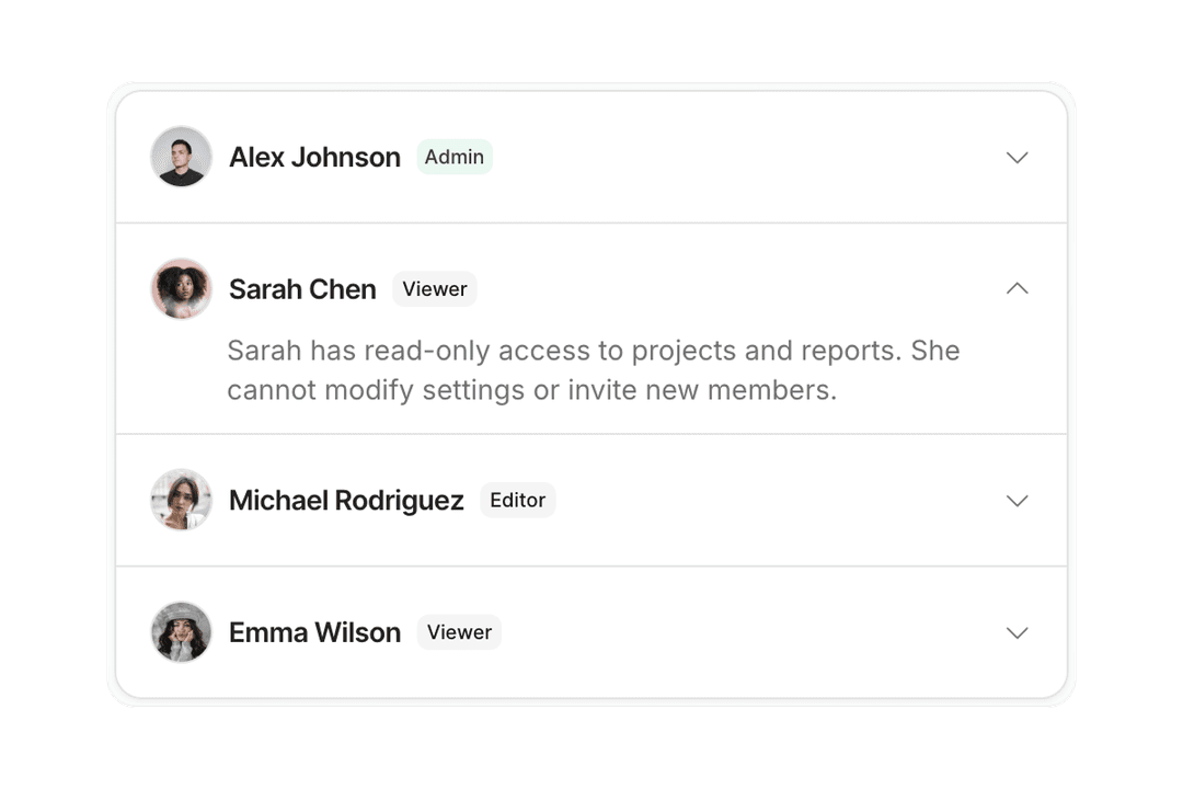
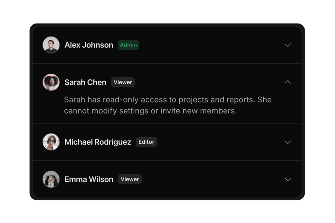
Accordion
11 components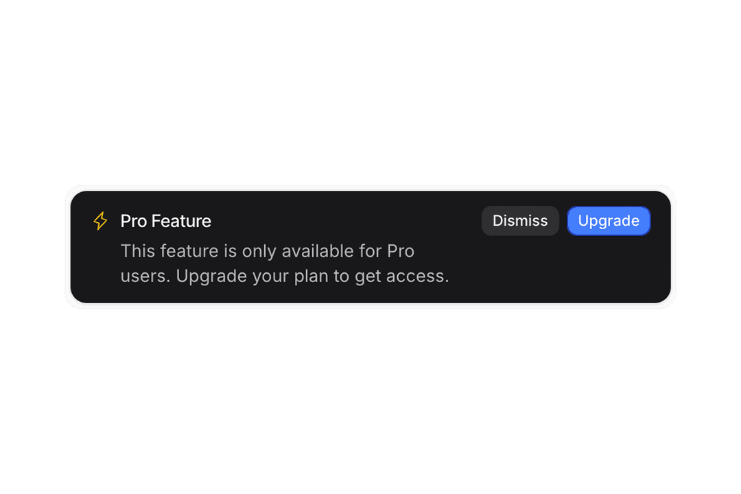
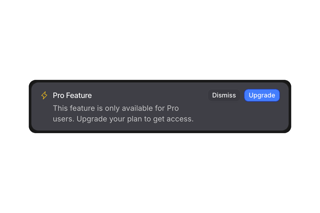
Alert
20 components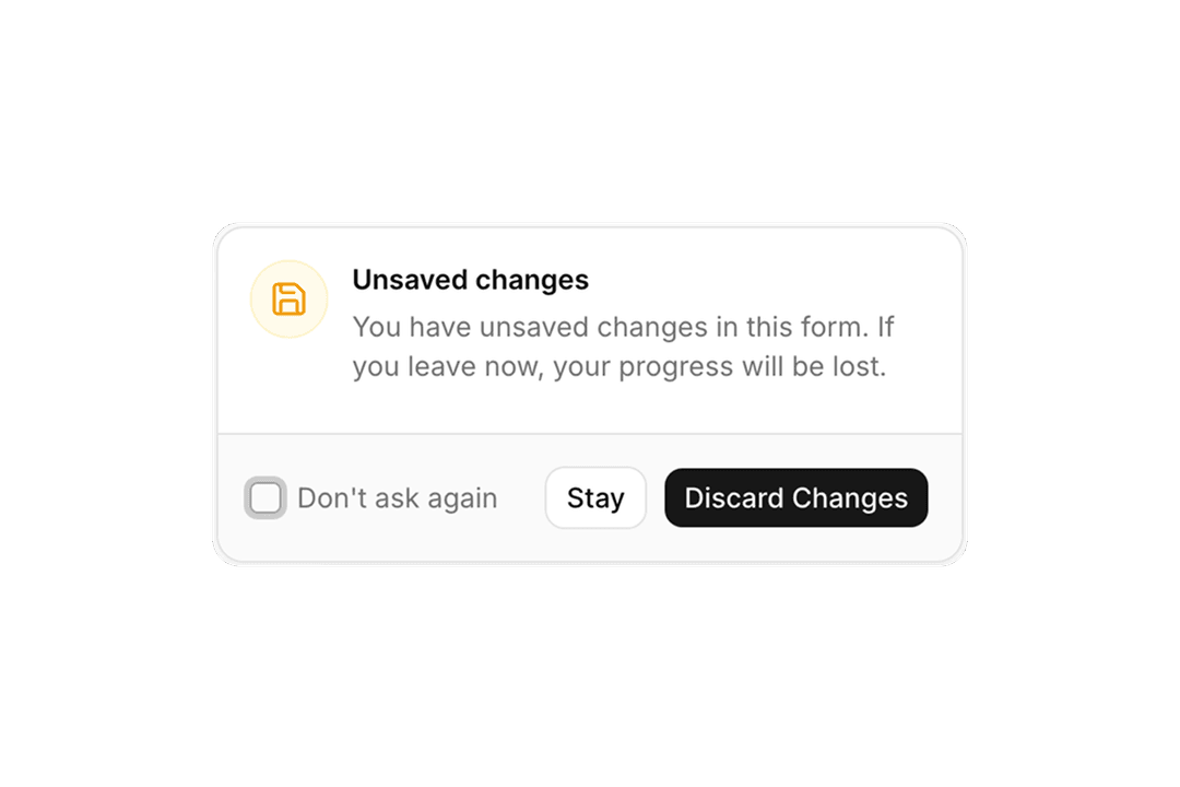
Alert Dialog
14 components

Aspect Ratio
8 components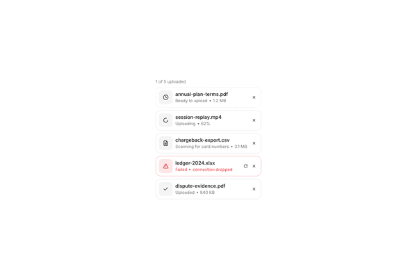
Attachment
6 components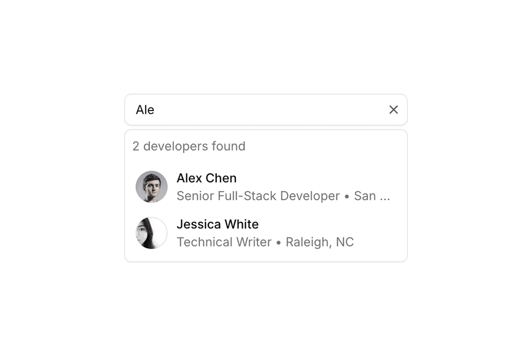
Autocomplete
12 components

Avatar
35 components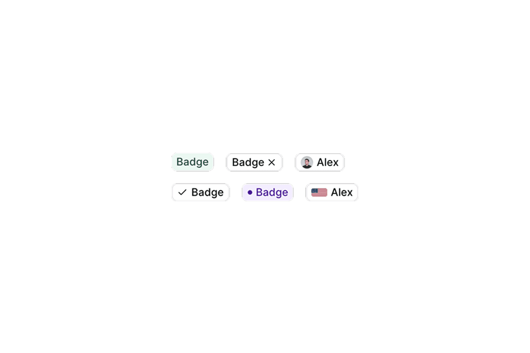
Badge
25 components
Breadcrumb
15 components
Bubble
7 components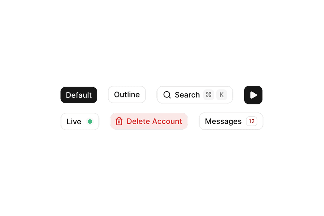
Button
61 components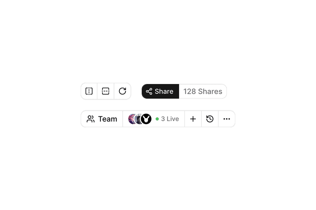
Button Group
57 components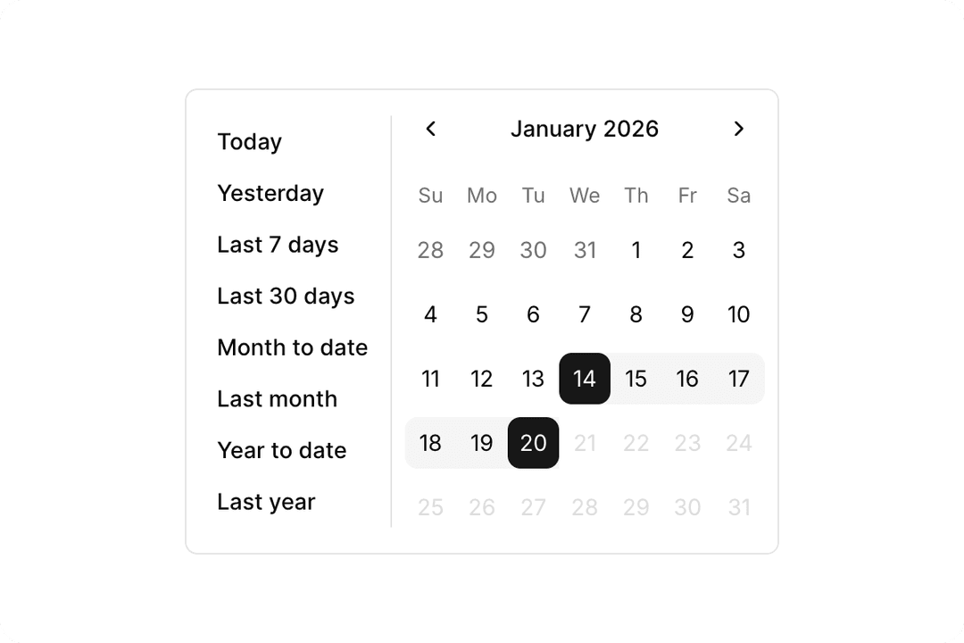
Calendar
30 components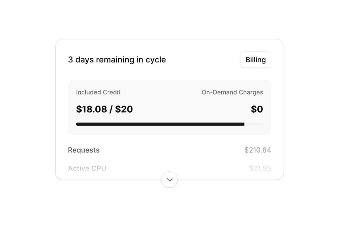
Card
18 components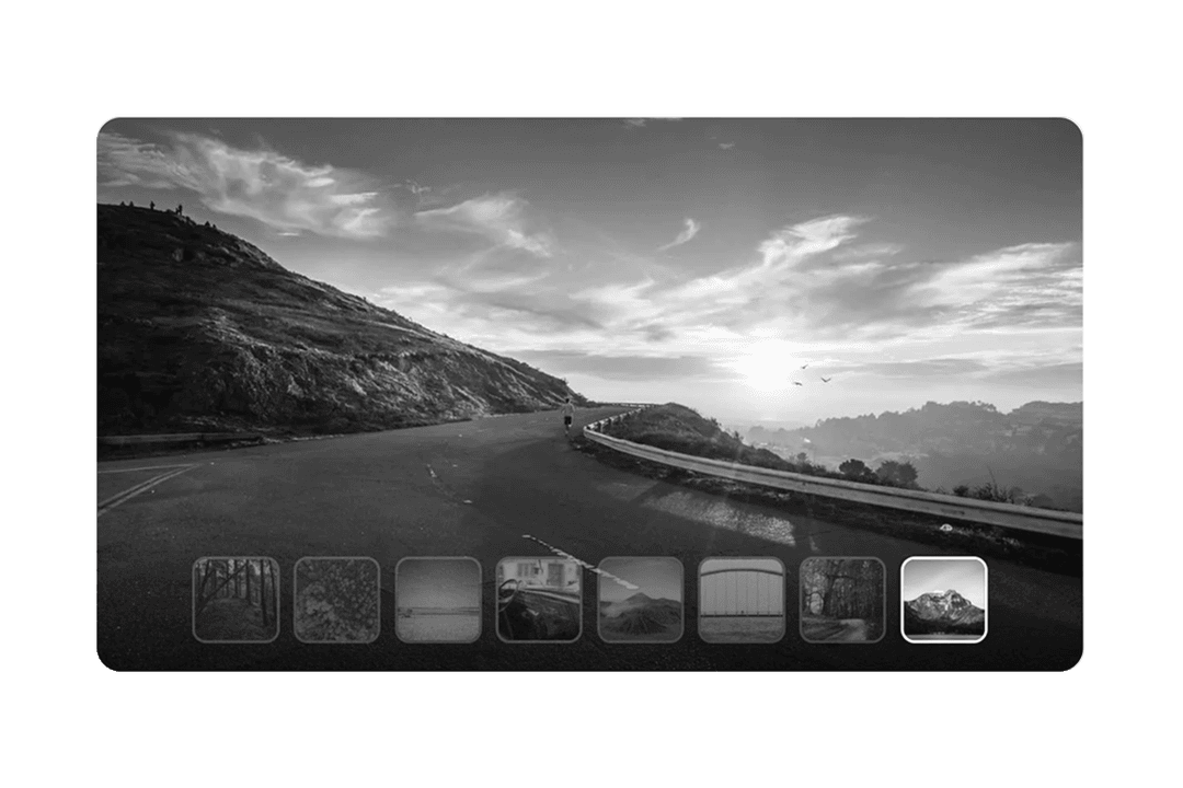
Carousel
11 components
Cascader
20 components

Chart
25 components
Checkbox
22 components
Code Block
27 components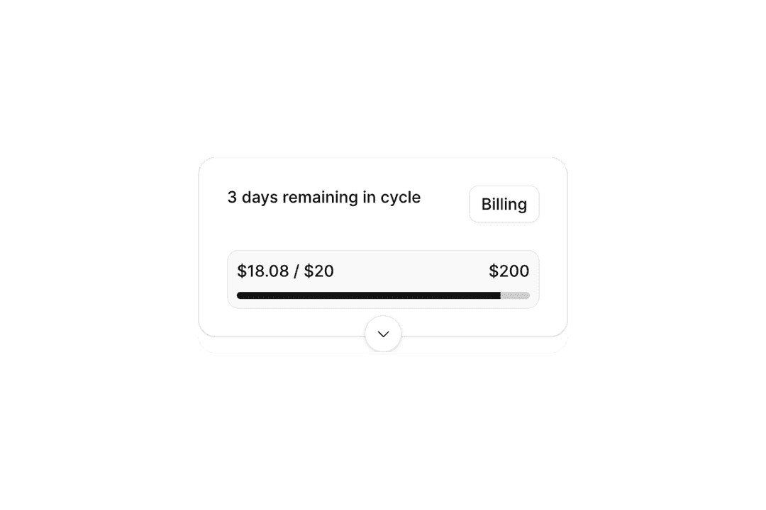
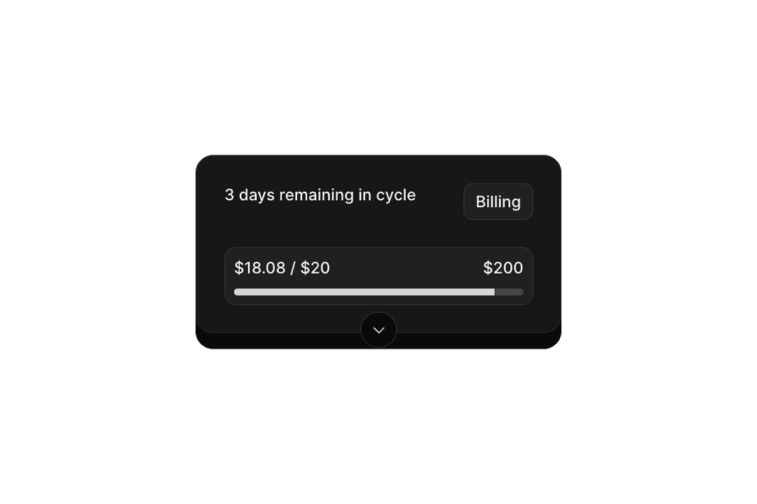
Collapsible
10 components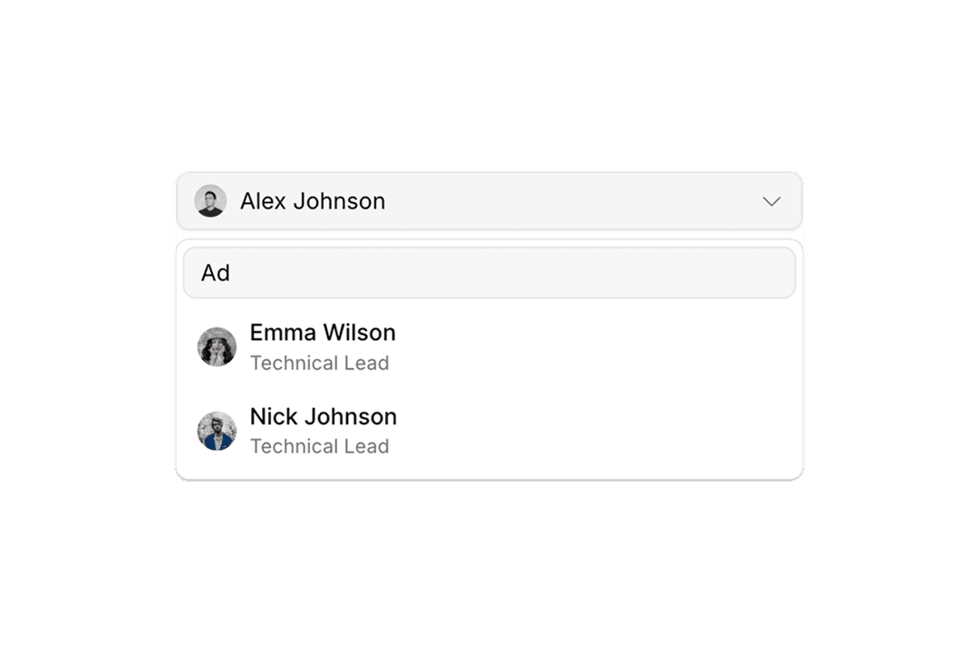
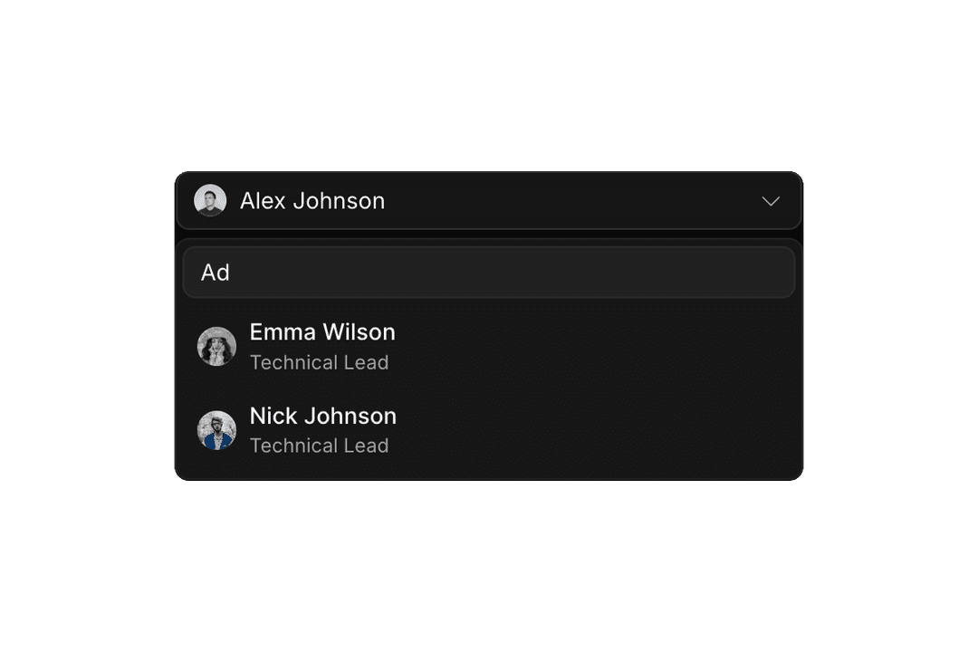
Combobox
28 components
Command
8 components
Context Menu
10 components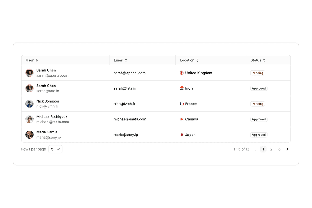
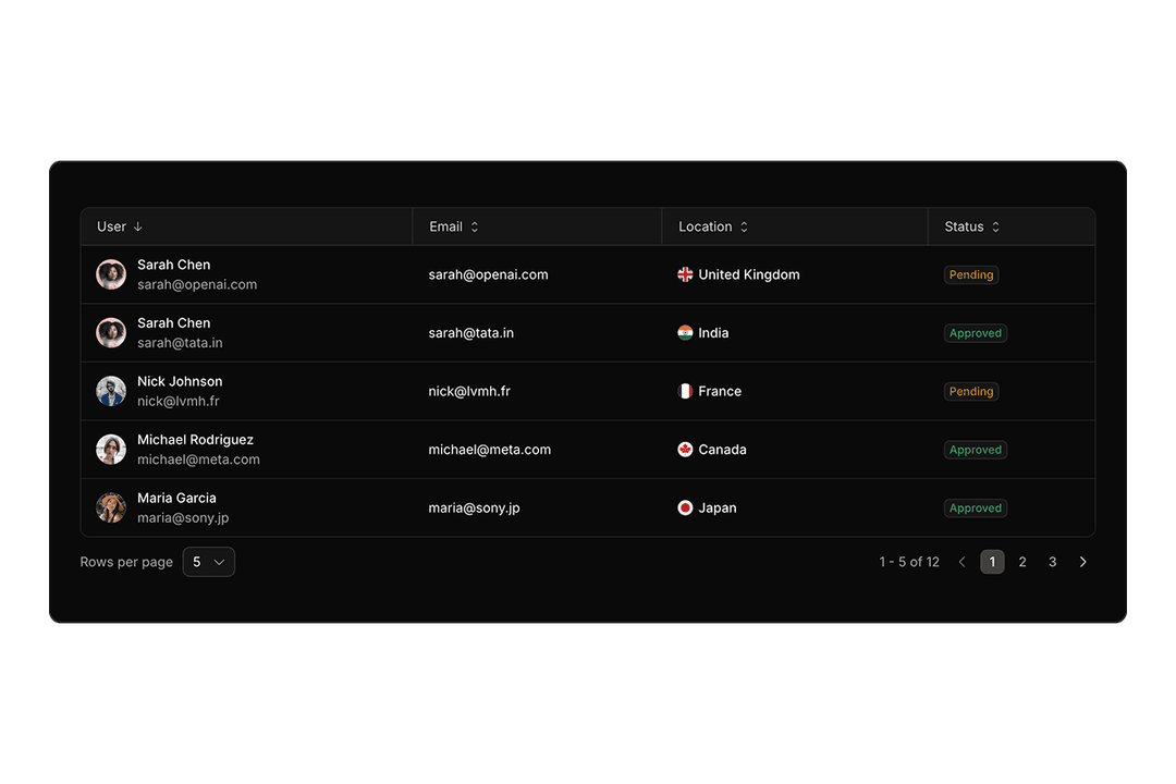
Data Grid
34 components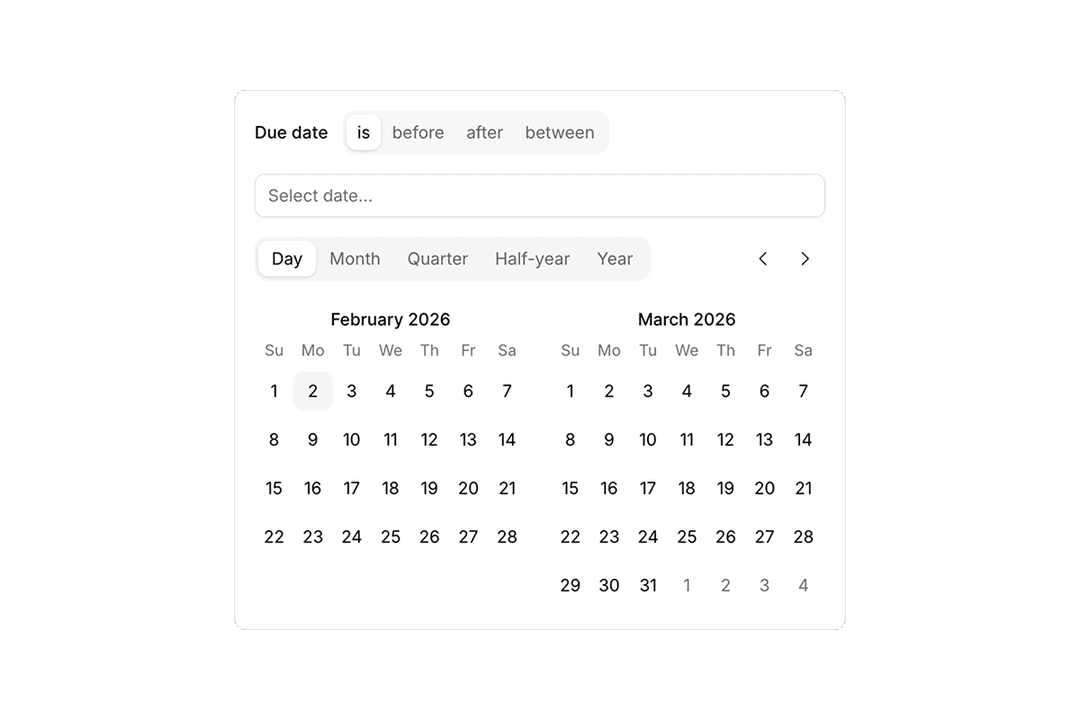
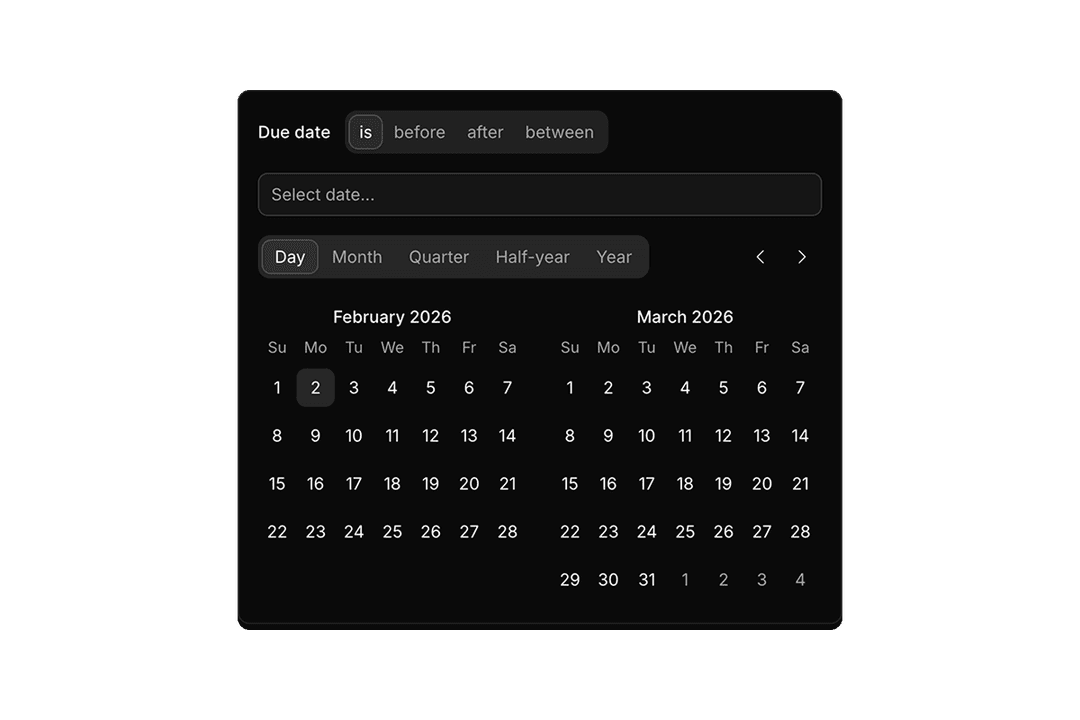
Date Selector
4 components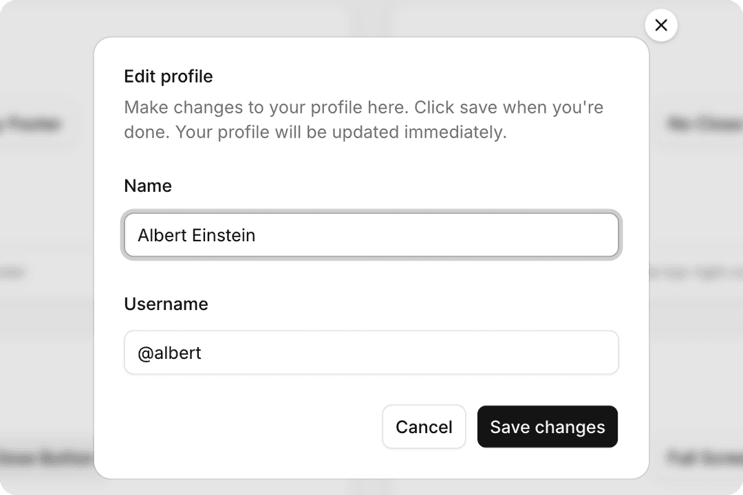
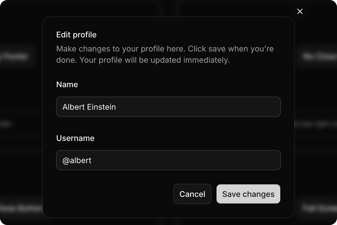
Dialog
10 components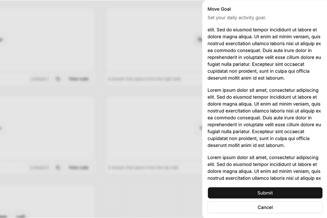
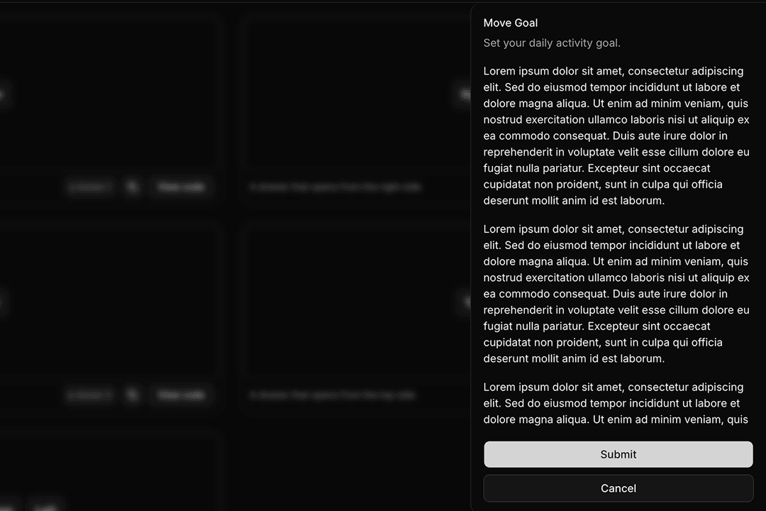
Drawer
5 components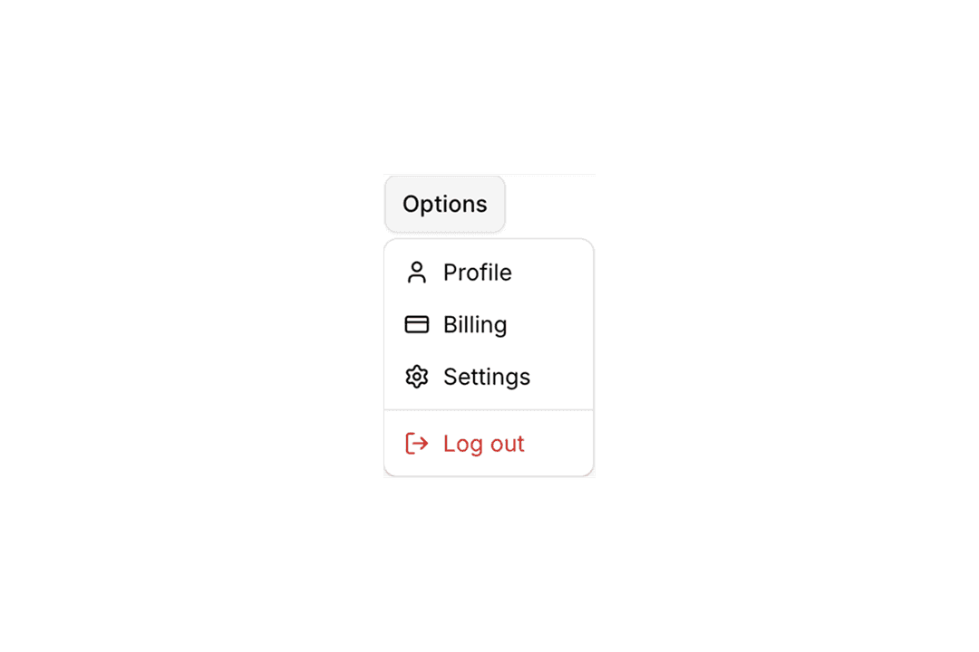
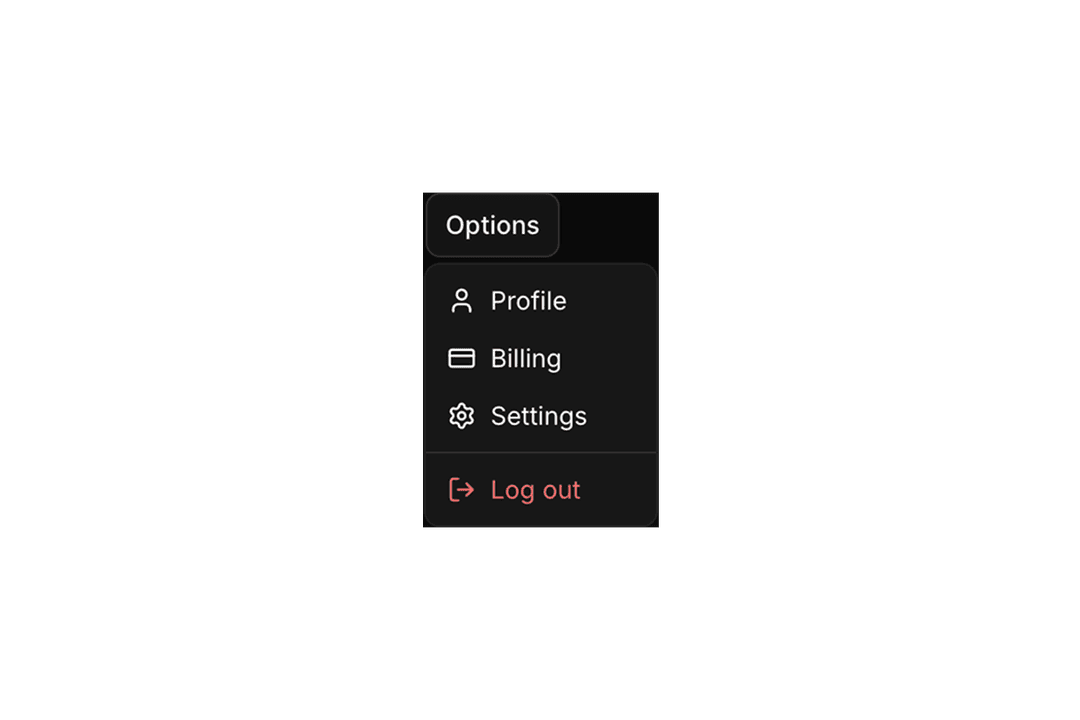
Dropdown Menu
18 components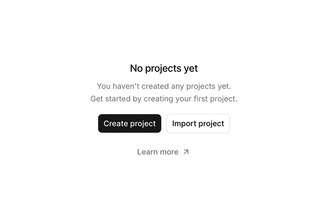
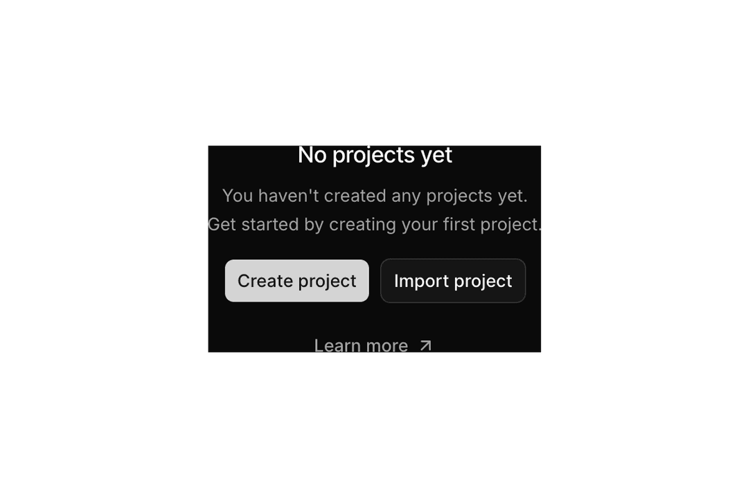
Empty
20 components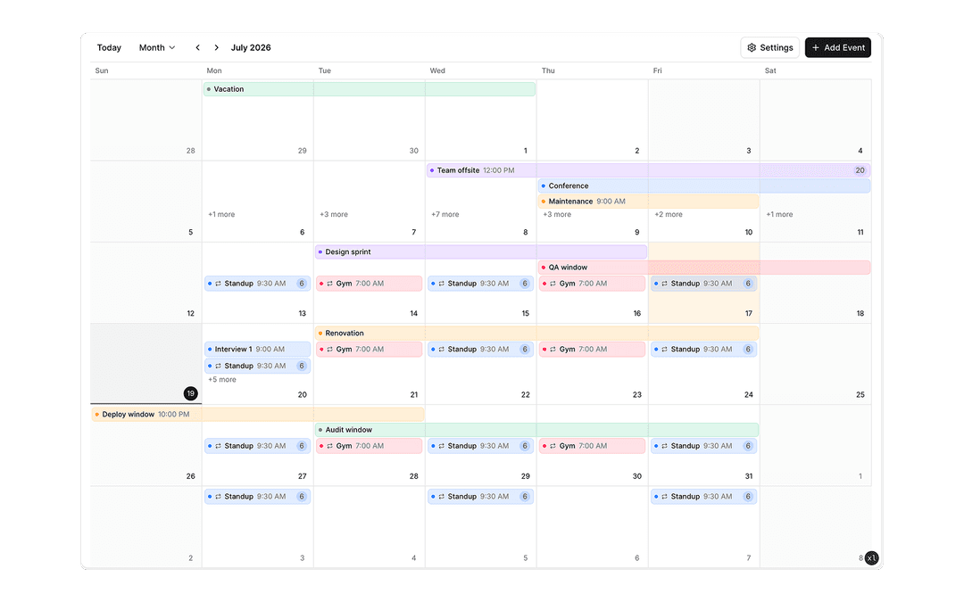
Event Calendar
5 components
Field
11 components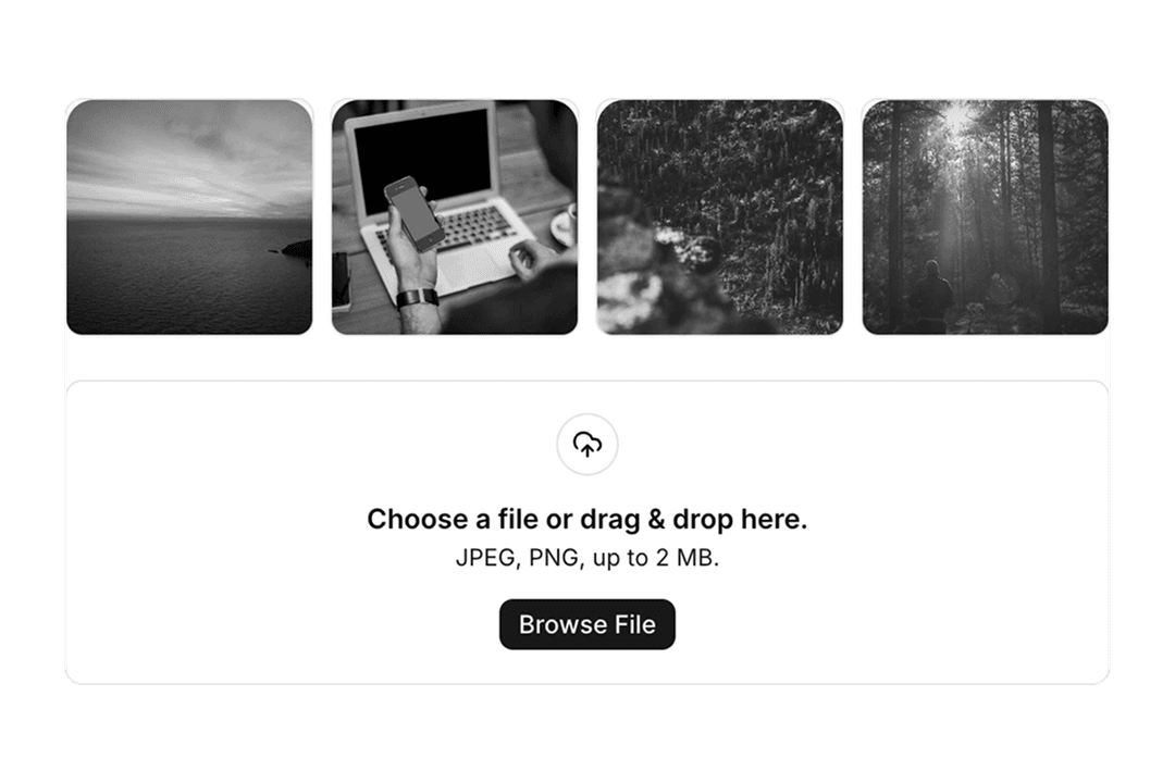
File Upload
10 components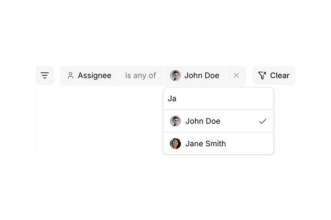
Filters
12 components

Frame
19 components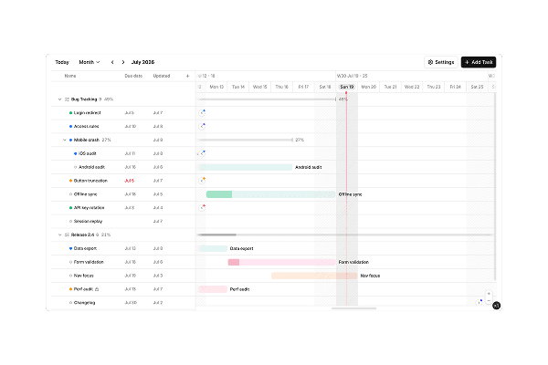
Gantt
7 components

Hover Card
8 components

Icon Stack
6 components

Icon Tile
17 components
Input
31 components
Input Group
40 components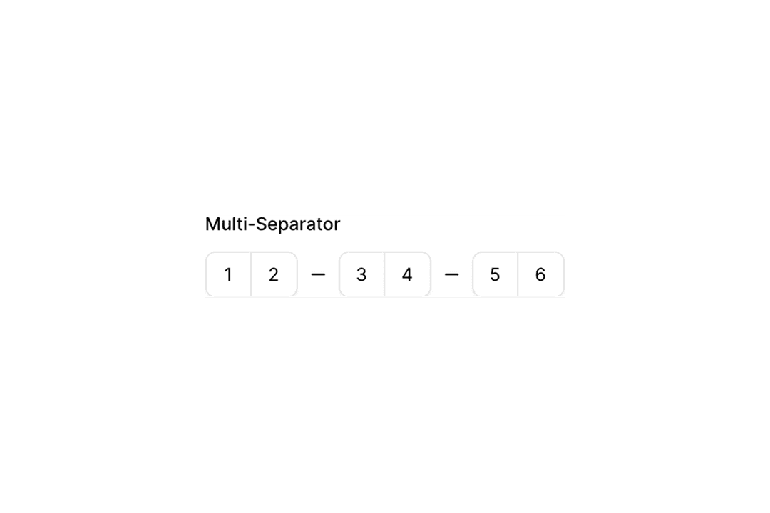
Input Otp
6 components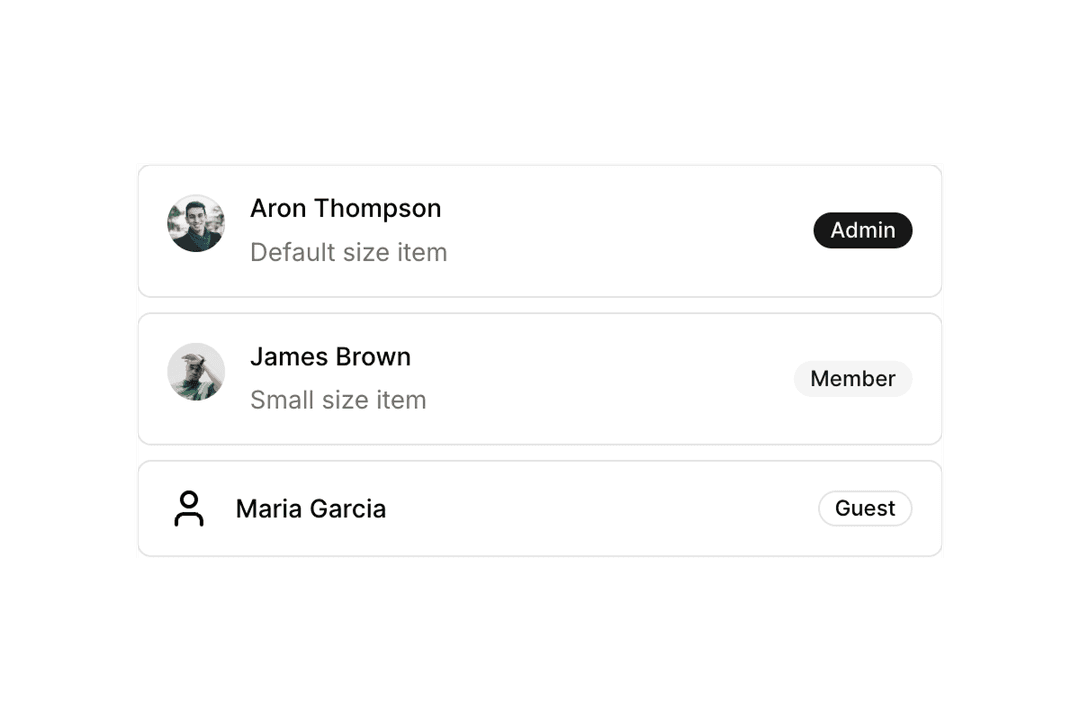
Item
12 components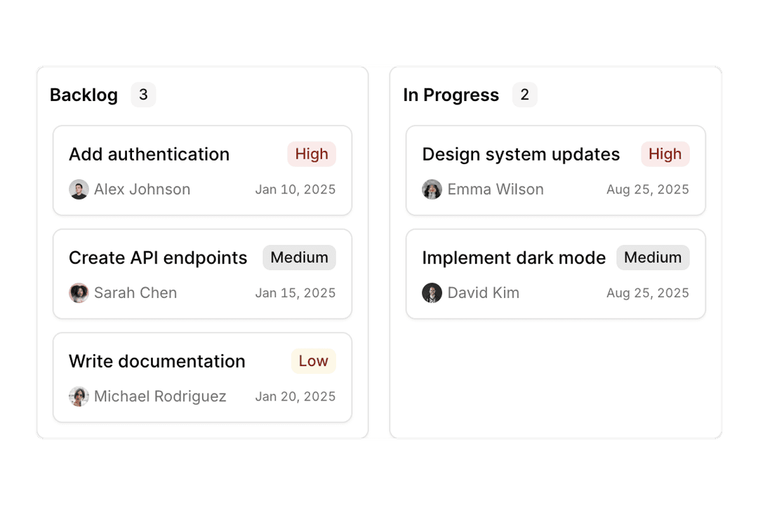
Kanban
6 components
Kbd
6 components

Label
13 components
Marker
6 components
Menubar
5 components
Message
7 components
Message Scroller
6 components

Native Select
6 components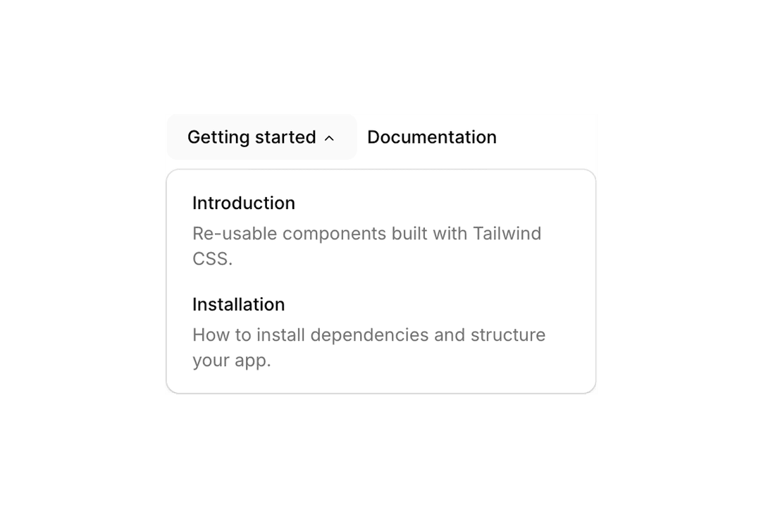
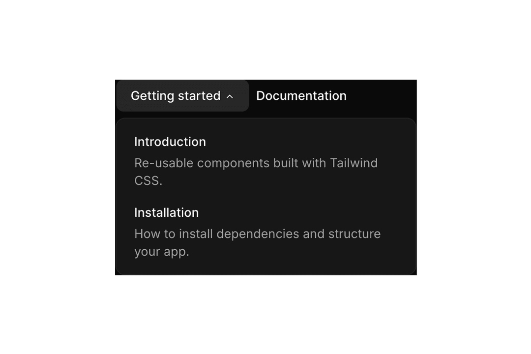
Navigation Menu
4 components
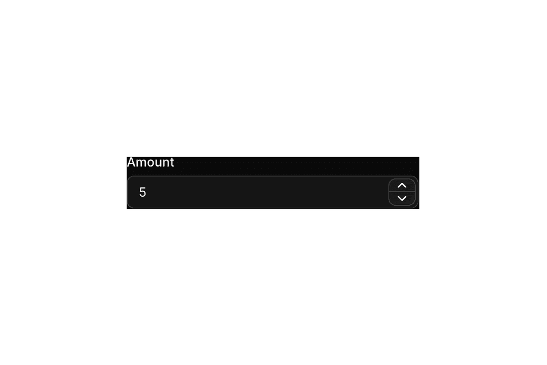
Number Field
6 components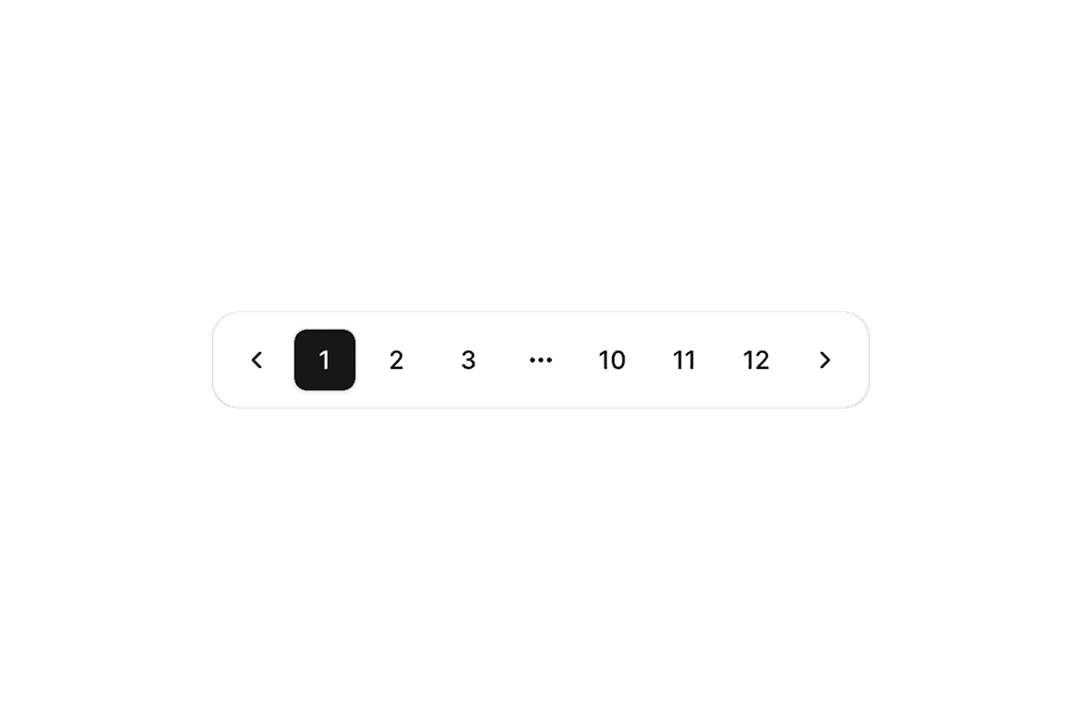
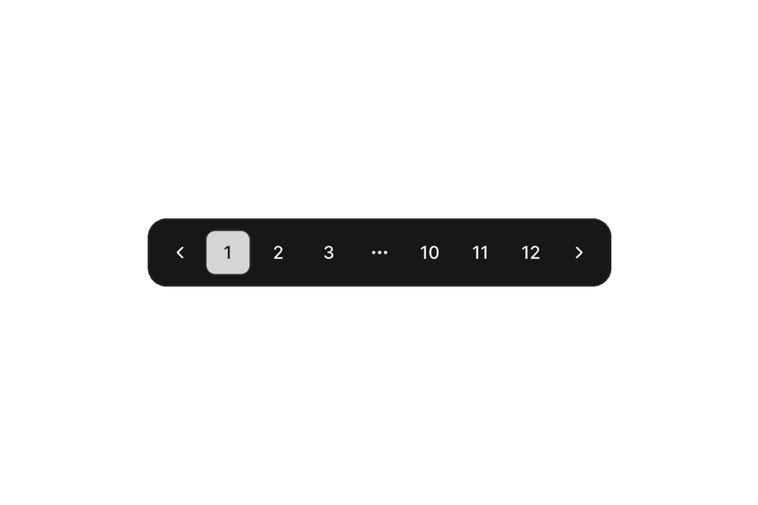
Pagination
15 components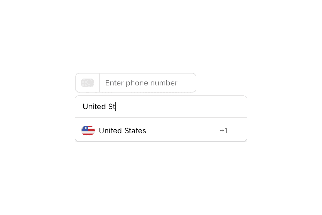
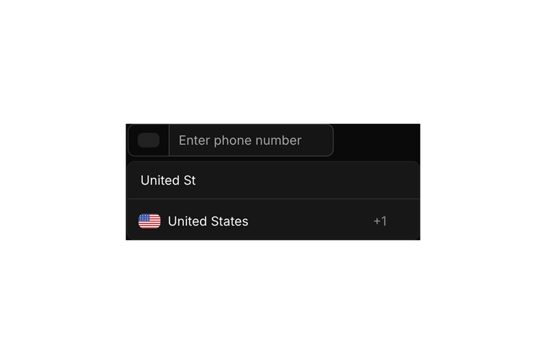
Phone Input
8 components
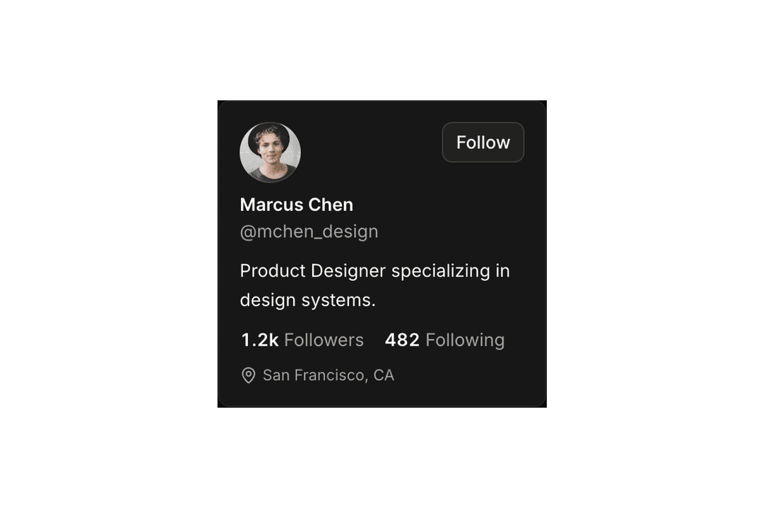
Popover
11 components
Progress
8 components
Questionnaire
7 components
Radio Group
17 components

Rating
9 components
Resizable
10 components

Scroll Area
5 components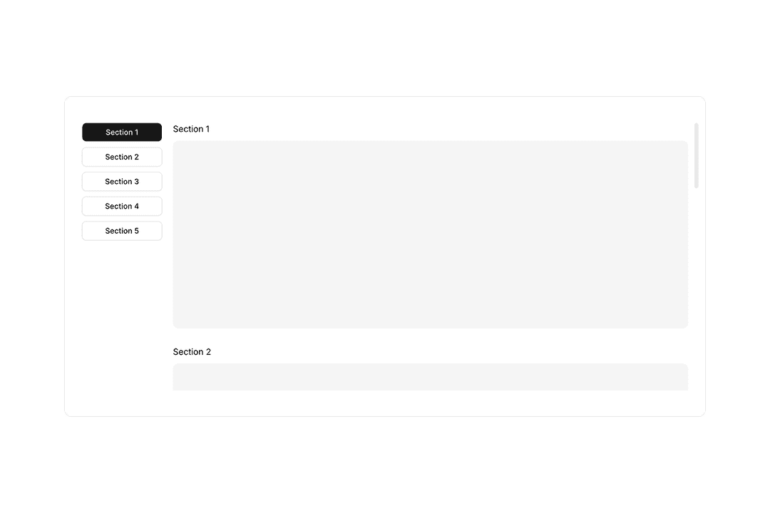
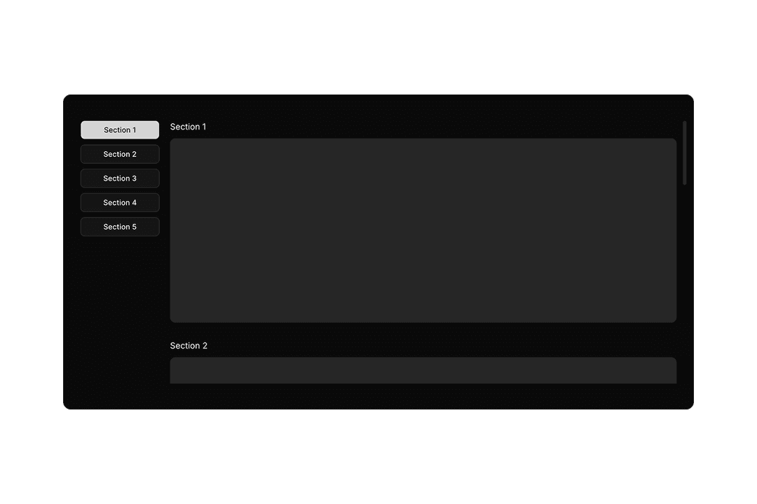
Scrollspy
2 components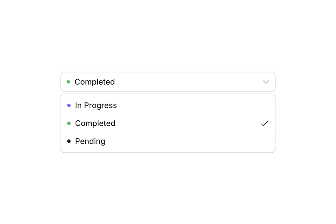
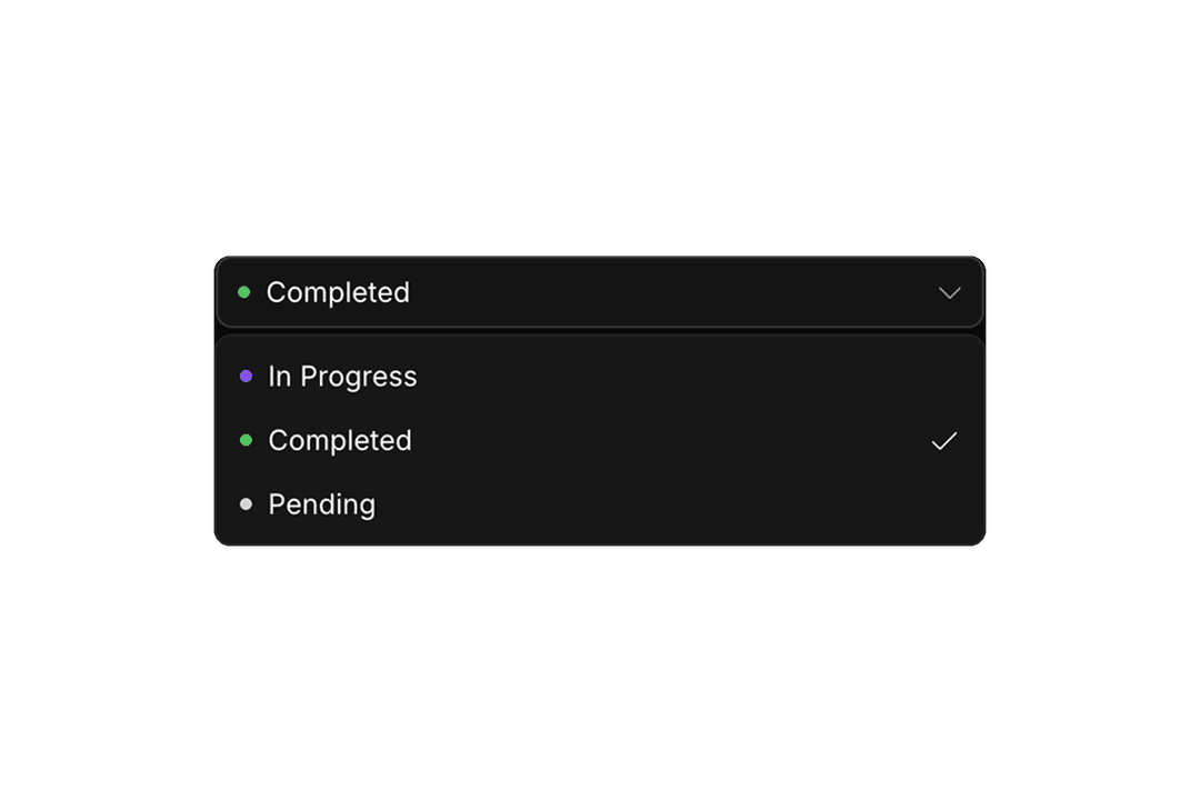
Select
33 components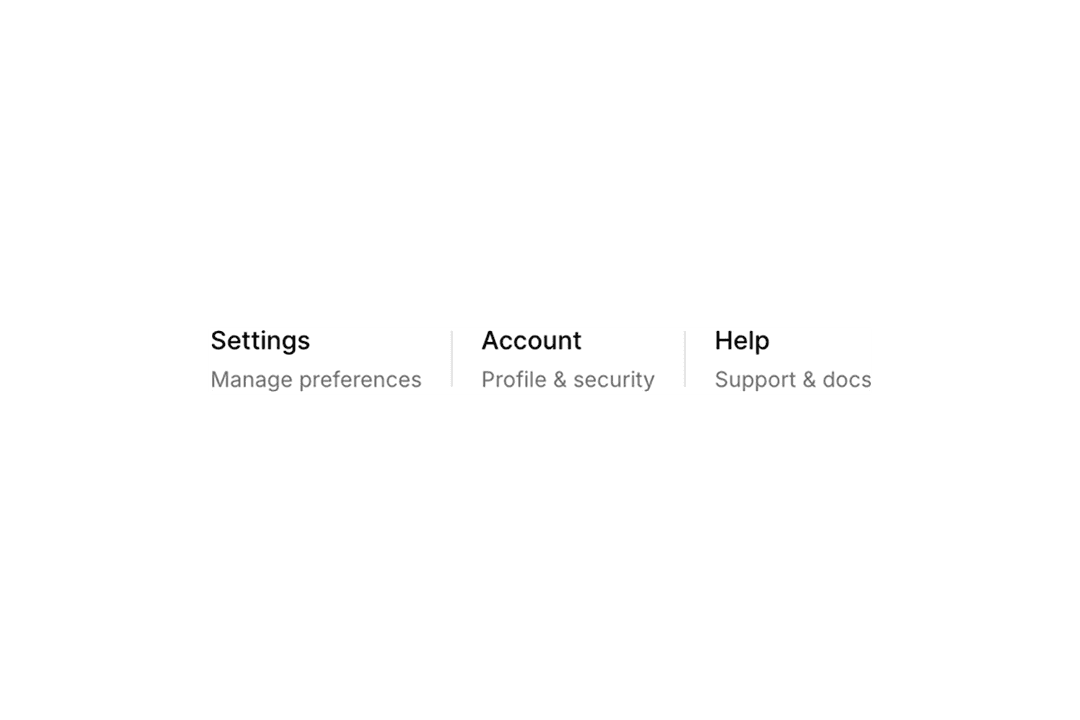

Separator
6 components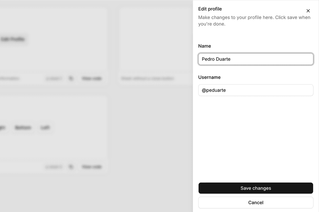
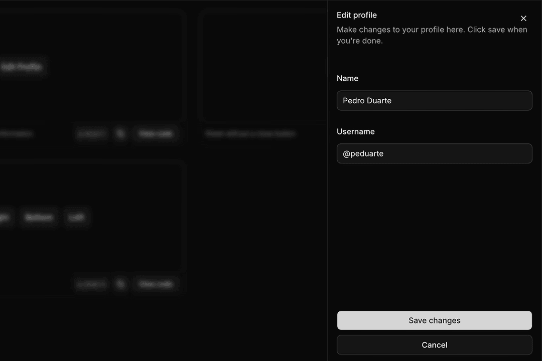
Sheet
4 components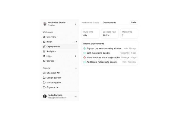
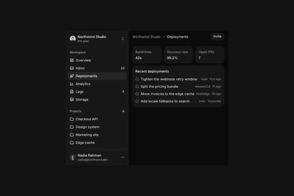
Sidebar
5 components

Skeleton
10 components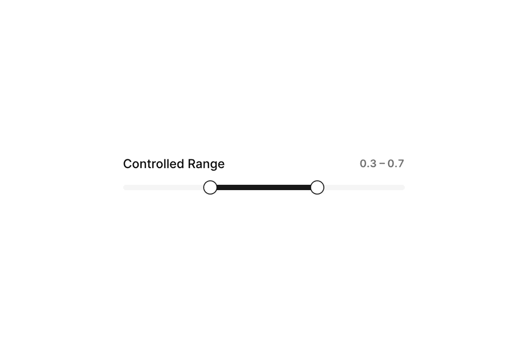
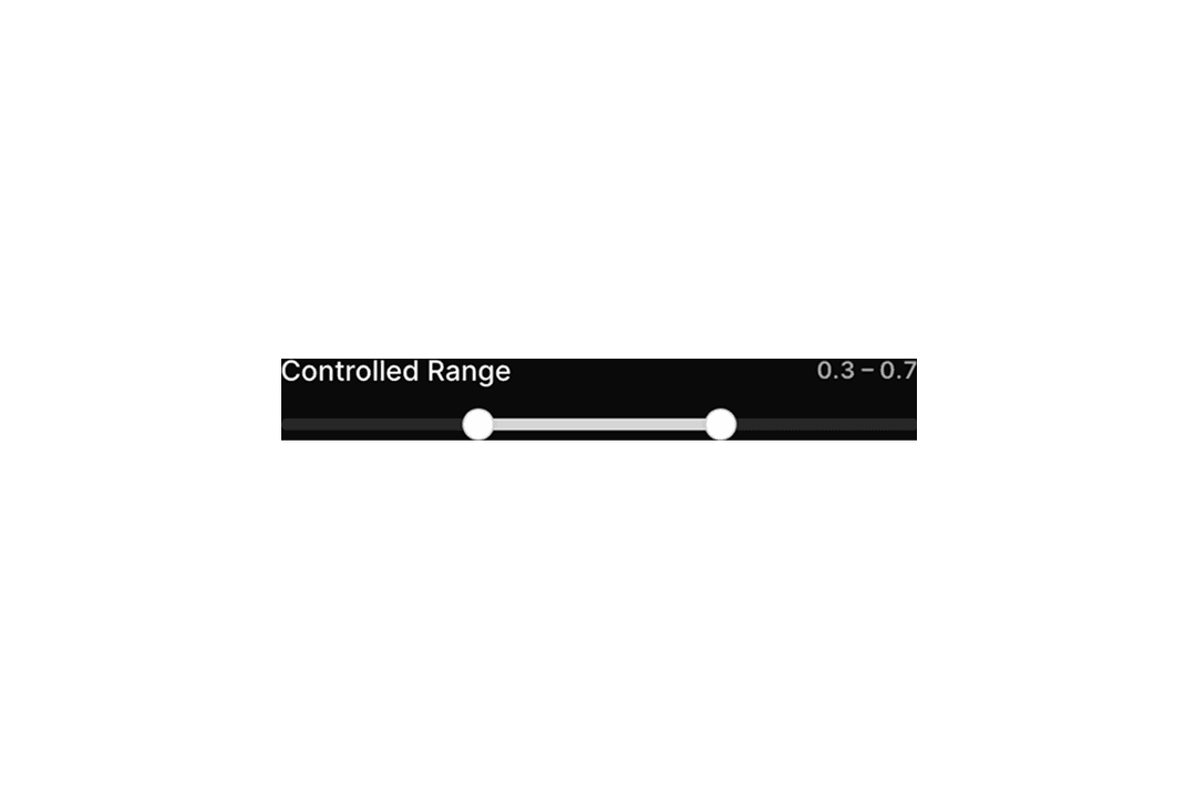
Slider
12 components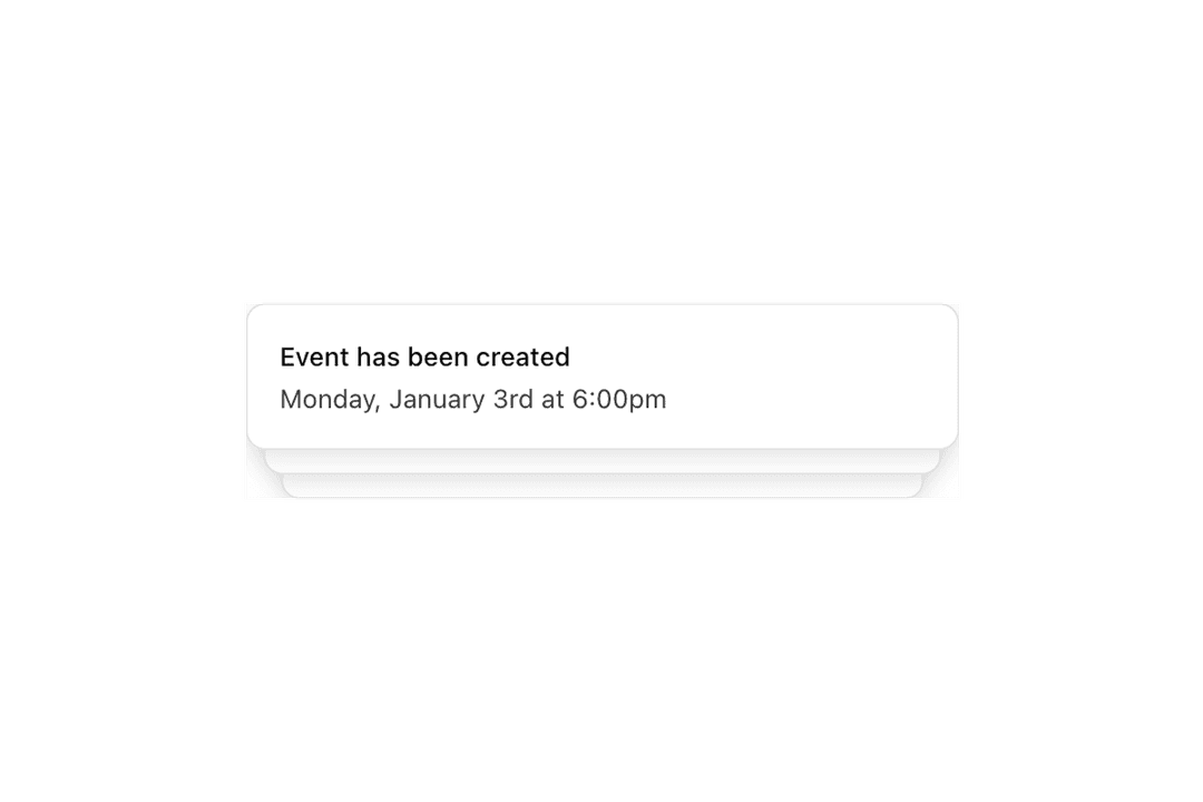
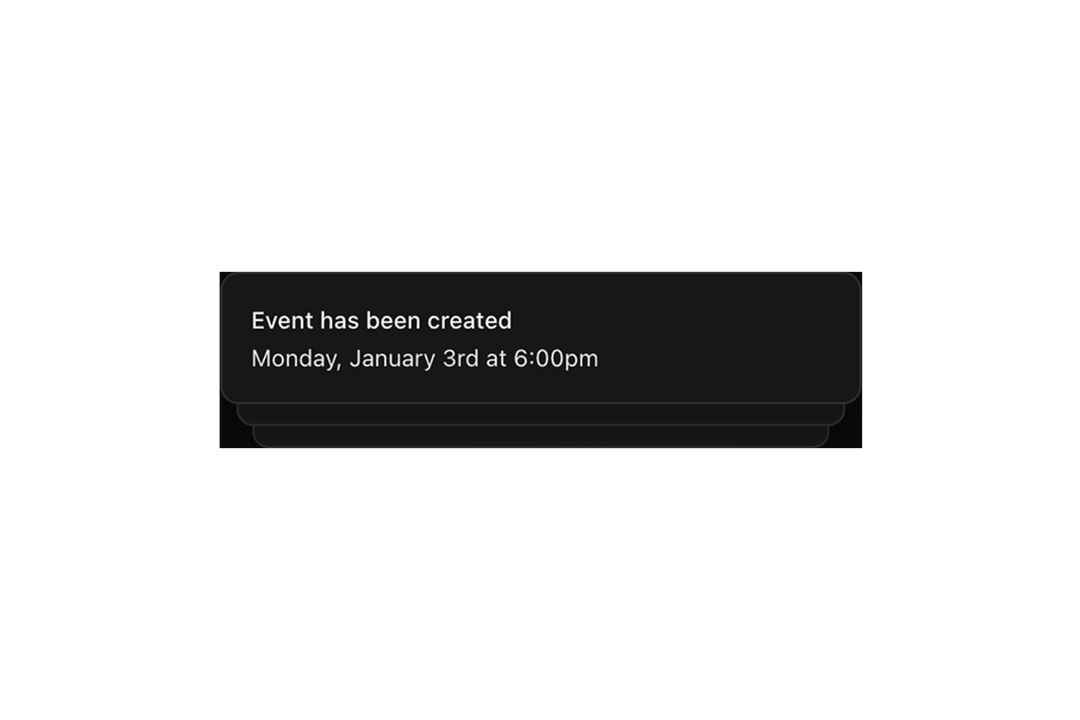
Sonner
21 components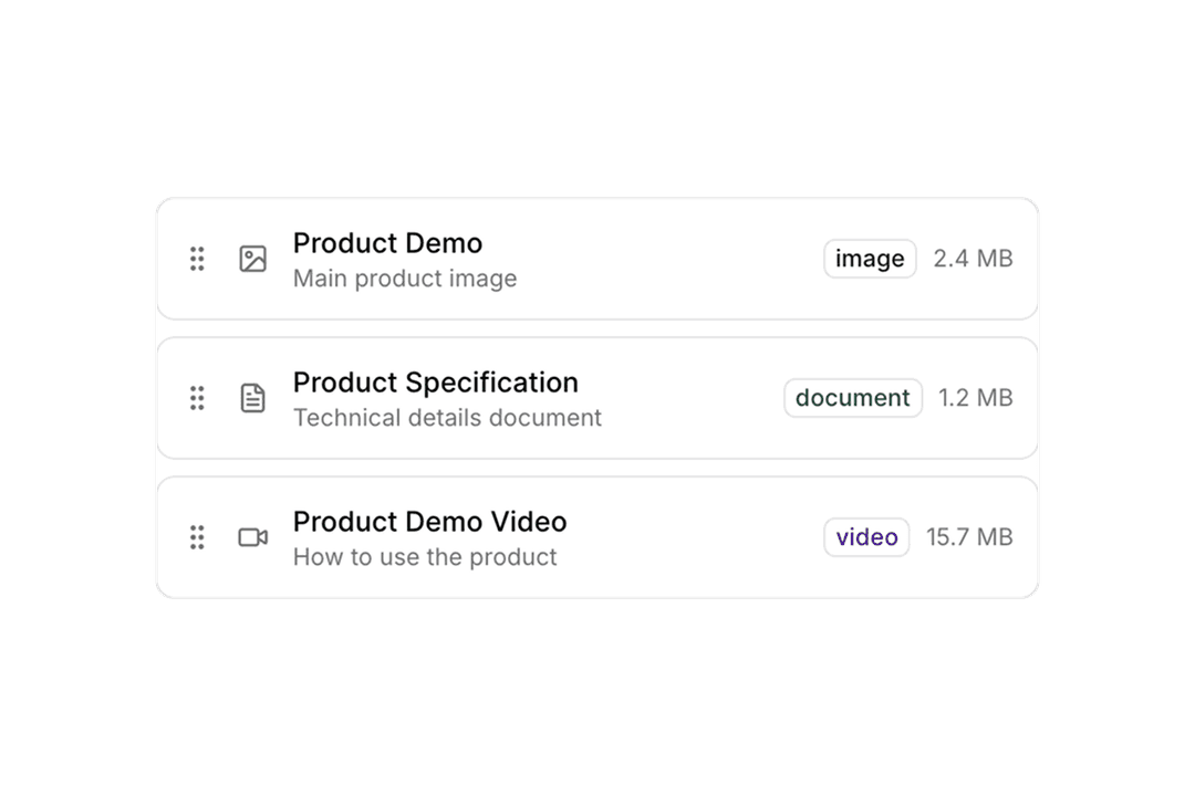
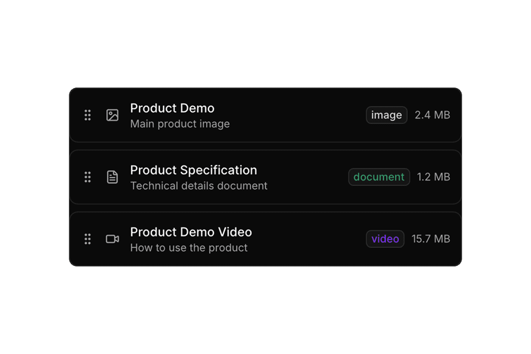
Sortable
8 components
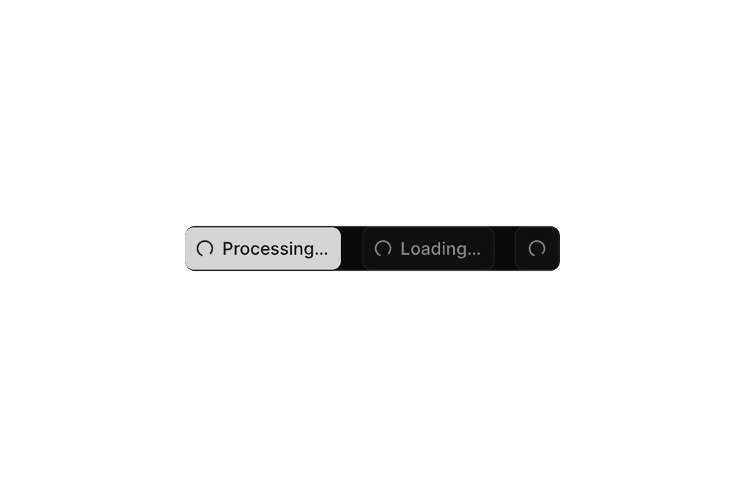
Spinner
12 components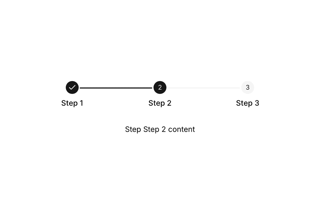
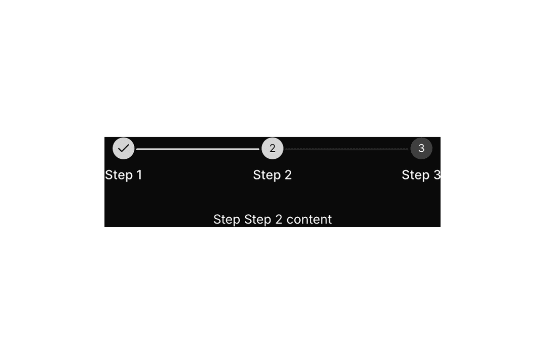
Stepper
15 components
Switch
14 components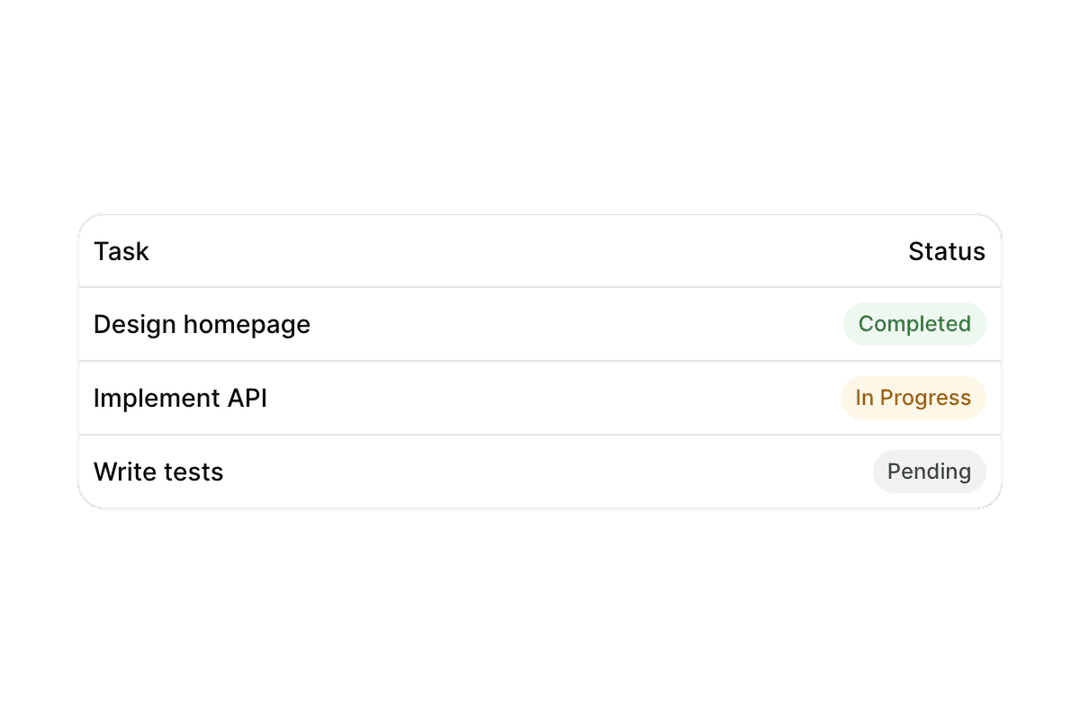
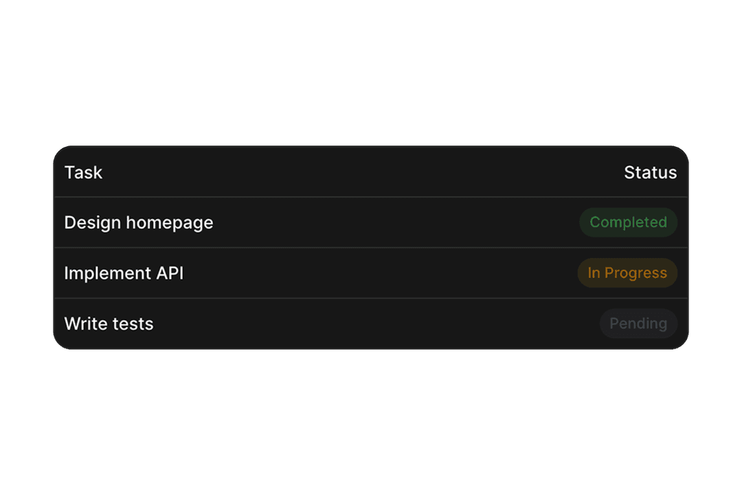
Table
17 components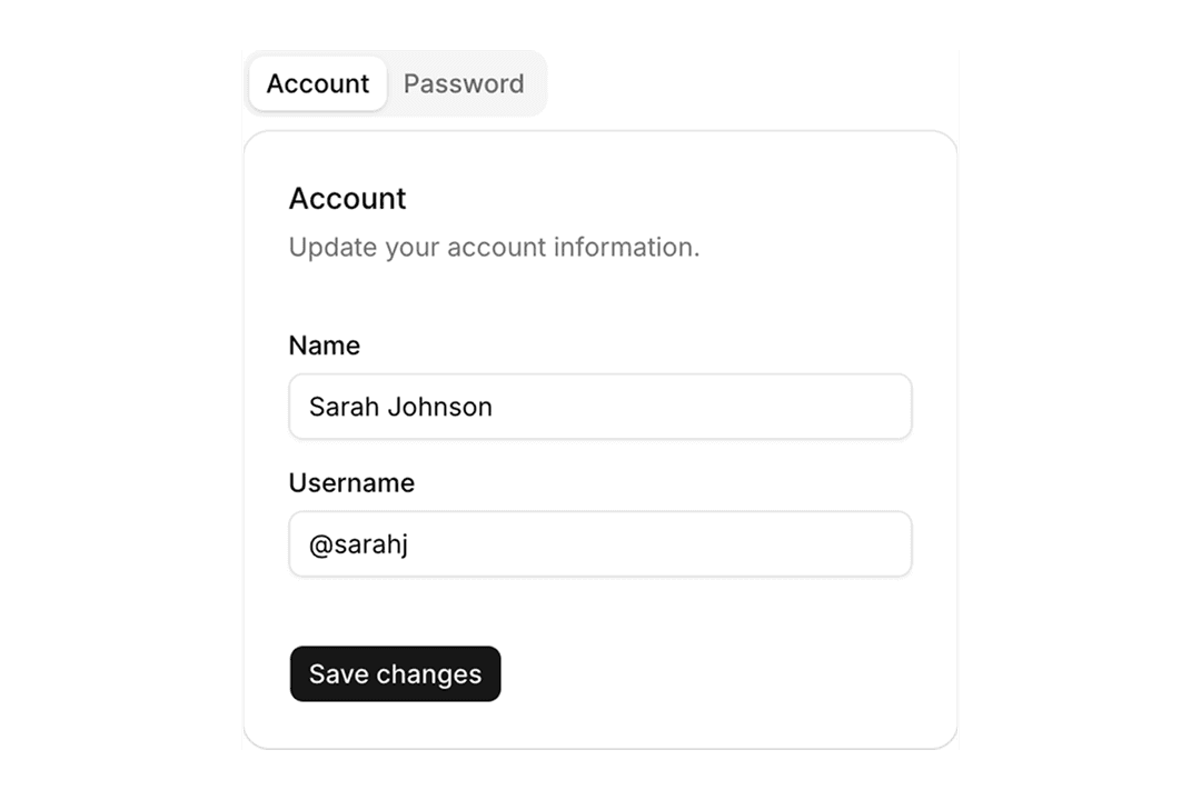
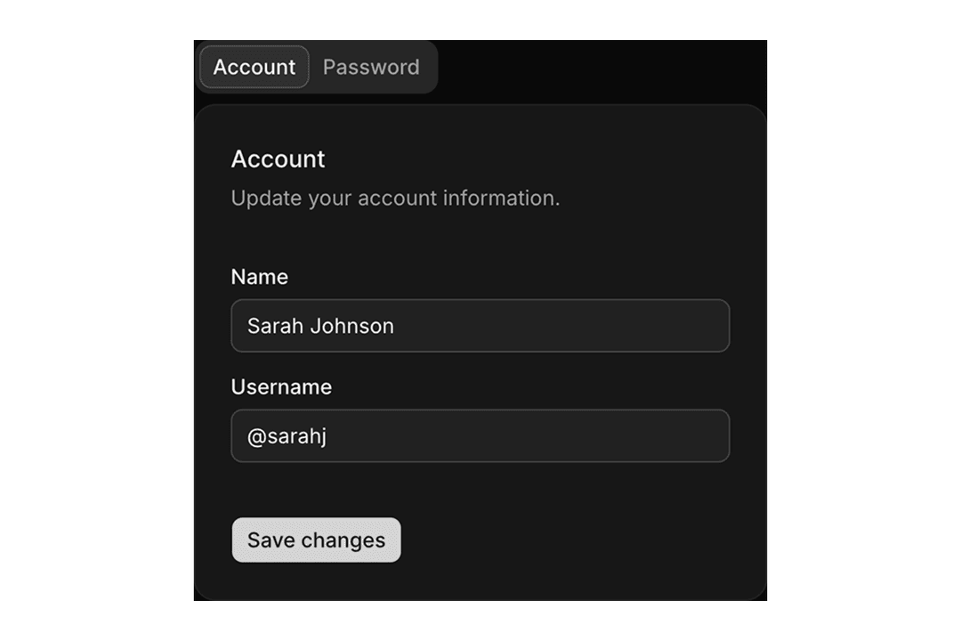
Tabs
9 components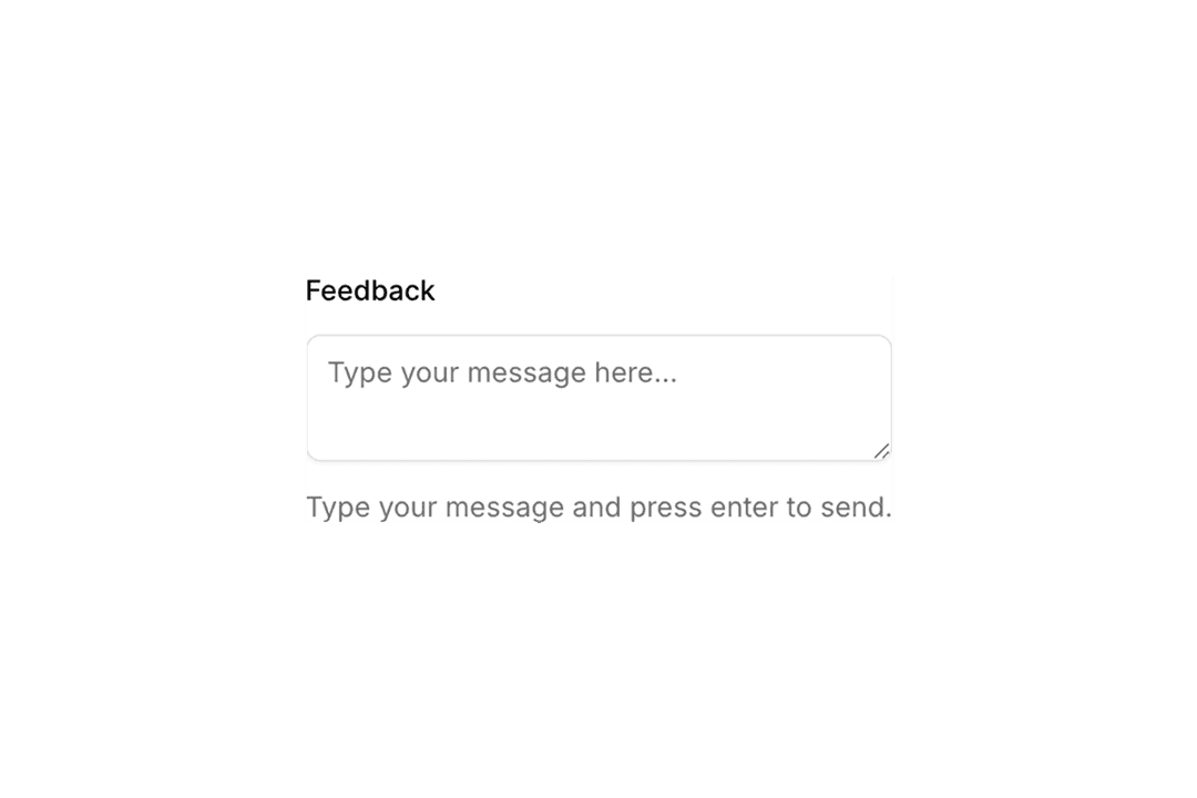
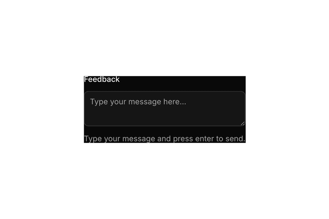
Textarea
6 components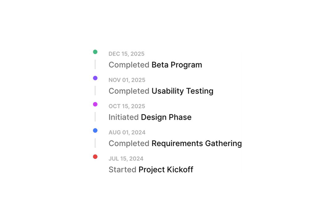
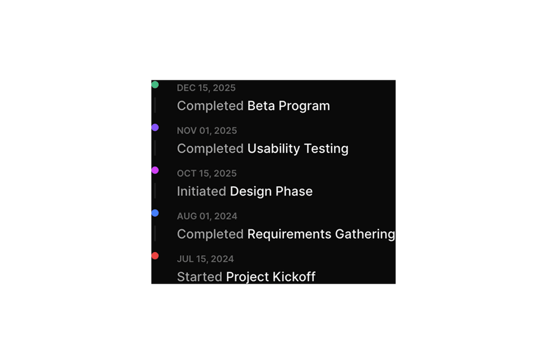
Timeline
12 components
Toggle
14 components

Toggle Group
16 components
Tooltip
16 components

Tree
7 componentsShadcn Components: Go Beyond AI Defaults
ReUI is an open-source component library for the shadcn/ui ecosystem. Every component is built from shadcn primitives, styled with Tailwind CSS, and composed inside realistic dashboard layouts, not isolated component playgrounds. Browse 1149 copy-ready catalog components and drop them directly into your React or Next.js project.
The library covers standard shadcn/ui components such as Button, Badge, and Dialog, plus 22 in-house custom components including Data Grid, Kanban, Filters, Event Calendar, Gantt, File Upload, Sortable, Timeline, and Stepper that extend the ecosystem beyond base shadcn/ui. All in-house components ship in both Radix UI and Base UI flavors.
Use the sections below to explore popular components, understand standard versus in-house components, check Shadcn Create compatibility, and compare Radix UI and Base UI variants.
What are ReUI Components?
ReUI components are reusable UI solutions composed from shadcn/ui components into real-world use cases: dashboards, forms, data views, and product flows, not isolated playground demos. Each component follows the shadcn copy-and-own model: the source installs directly into your repository via the shadcn CLI (npx shadcn@latest add). You own the code, customize it with your Tailwind CSS tokens, and extend it without version conflicts or package lock-in.
The difference between a shadcn primitive and a composed catalog component is scope. A primitive such as Button renders a styled, accessible element. A composed component is: a Data Grid row with inline editing, a Filters panel that persists state to the URL via nuqs, or a Stepper wired to per-step react-hook-form validation. Catalog components show how primitives combine inside production layouts.
Popular Components
Each entry links to the full component page where you can browse layouts, copy source code, and review component API documentation.
- Shadcn Data Grid@tanstack/react-table and @tanstack/react-virtual-powered tables with column pinning, row and column drag-and-drop via @dnd-kit/core, resizing, sorting, infinite scroll, and CRUD flows.
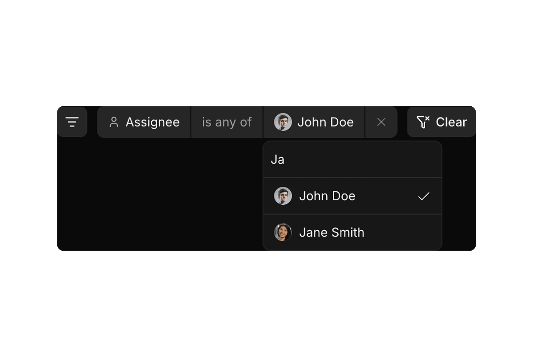
- Shadcn FiltersSchema-driven filter panels with URL state via nuqs, zod validation, and multi-field types: text, select, multi-select, date range, and boolean.
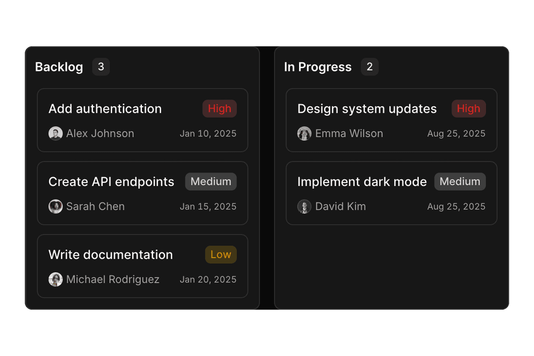
- Shadcn KanbanDrag-and-drop task boards using @dnd-kit/core and @dnd-kit/sortable with dynamic overlays and composable card content.
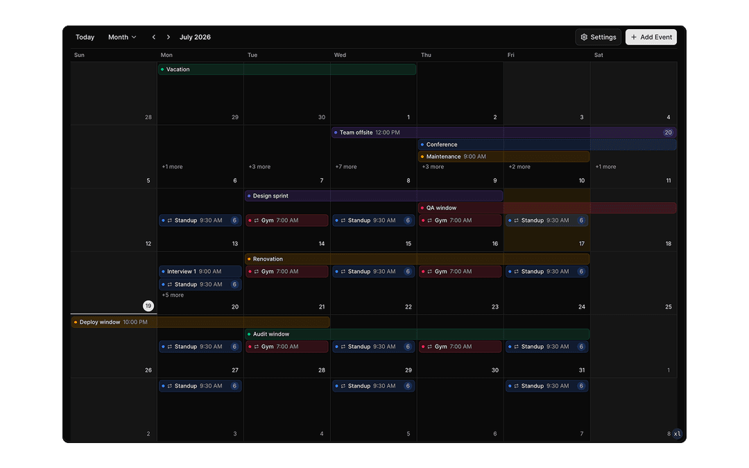
- Shadcn Event CalendarMonth, week, day, and agenda views with drag-and-drop scheduling, resource lanes, recurring events, and inline editing for planners and booking tools.
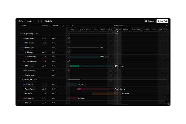
- Shadcn GanttProject timelines with task trees, dependency bars, split panes, day-to-year zoom, and drag-to-reschedule editing for roadmaps and resource planning.
- Shadcn SortableVertical, grid, and nested list reordering with keyboard-accessible @dnd-kit/sortable drag overlays.
- Shadcn Chartrecharts and motion-powered bars, areas, pies, radars, and animated dashboard visuals.
- Shadcn TimelineDeployment logs, activity feeds, milestones, and sequential event views in vertical and horizontal orientations.
- Shadcn StepperMulti-step wizards and onboarding flows with per-step react-hook-form validation and progress indicators.
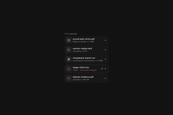
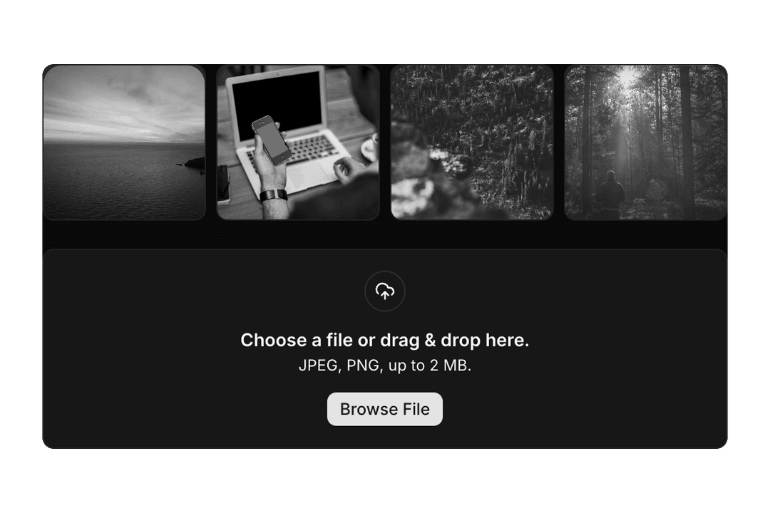
- Shadcn File UploadDropzones, image previews, multi-file flows, and zod-validated upload inputs.
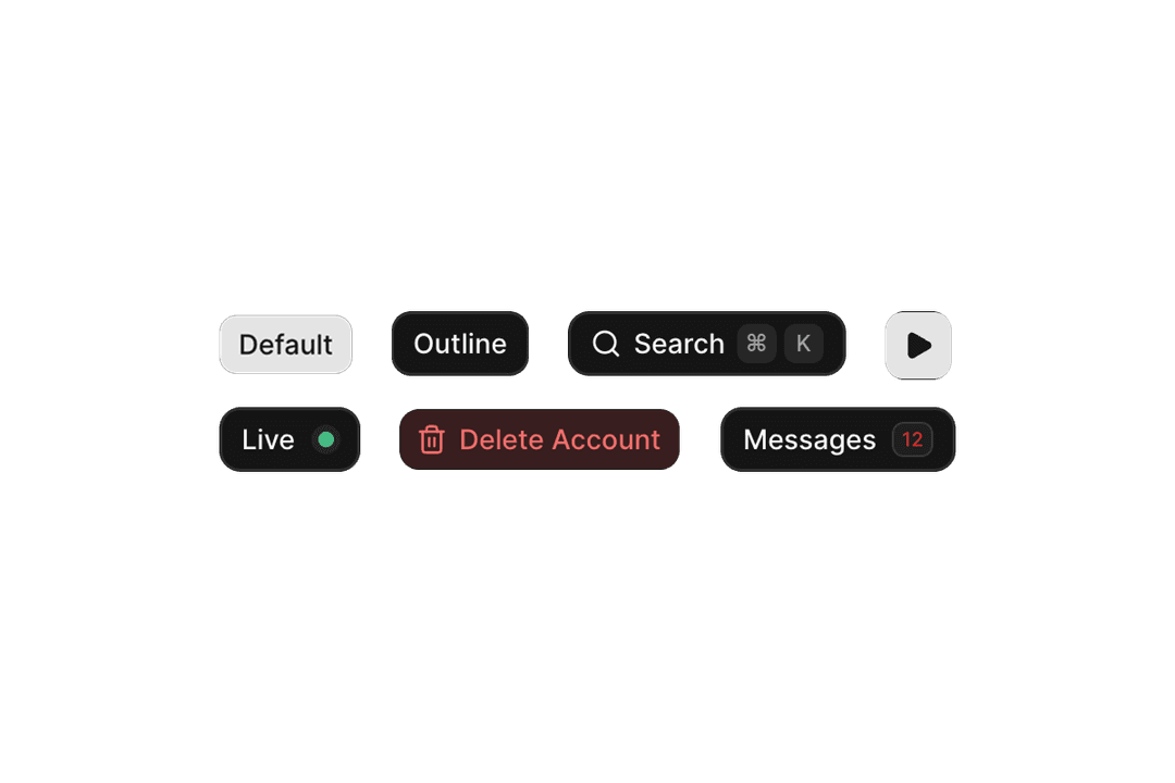
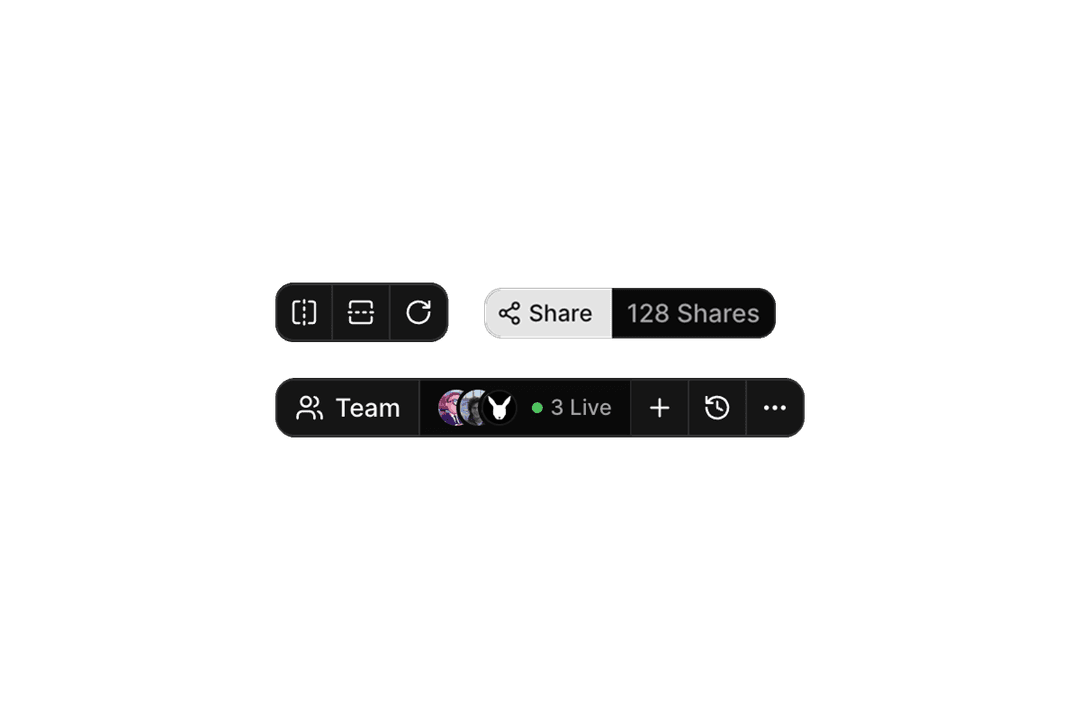
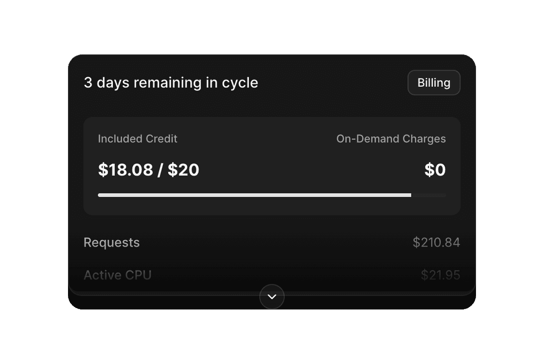
- Shadcn Button, Shadcn Button GroupPrimary actions, toolbars, loading states, and segmented controls: the largest component set in ReUI.
- Shadcn AlertStatus banners, validation summaries, and inline feedback for success, warning, and destructive states.
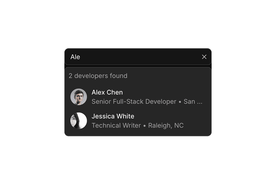
- Shadcn Combobox, Shadcn AutocompleteSearchable single and multi-select components with async filtering and keyboard navigation.
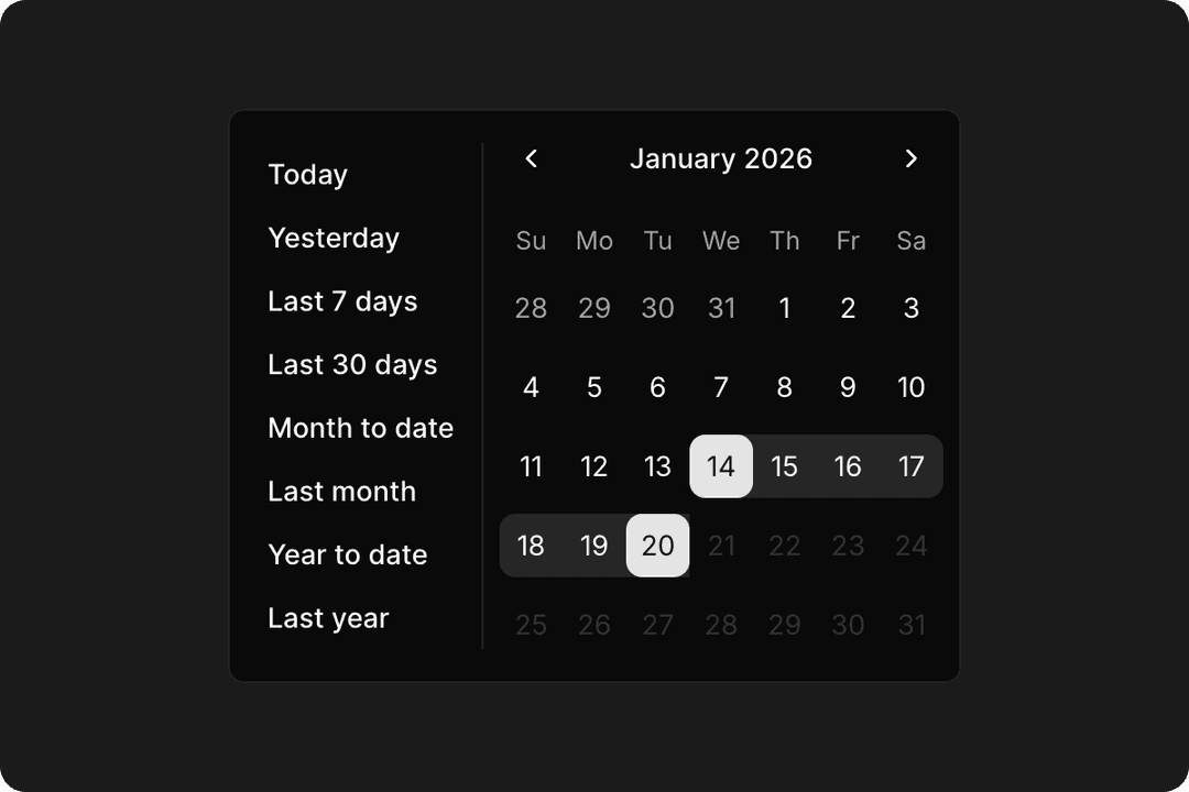
- Shadcn CalendarDate ranges, preset shortcuts, and react-day-picker-based localization.
- Shadcn TreeExpandable hierarchies and file-style navigation built on @headless-tree/react.
- Shadcn RatingStar and icon-based rating inputs with half-star, read-only, and custom icon support.
- Shadcn Input OTP, Shadcn Phone Input, Shadcn Number FieldVerification codes via input-otp, international numbers via react-phone-number-input, and numeric spinbuttons.
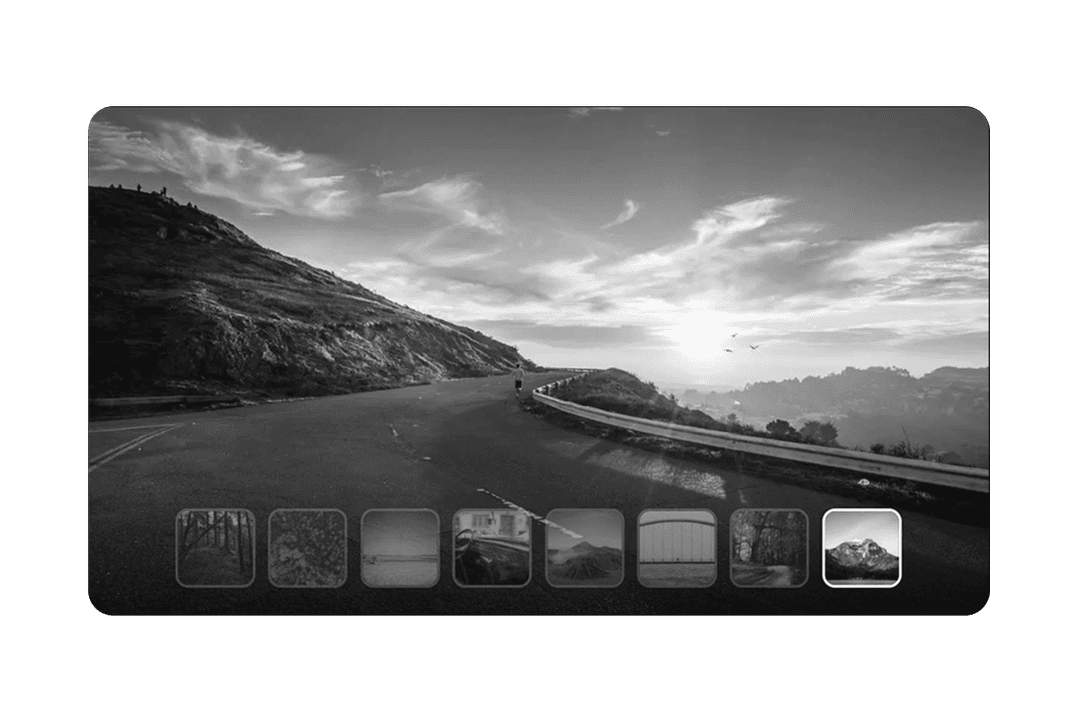
- Shadcn CarouselSliders, thumbnails, and media galleries powered by embla-carousel-react.
- Shadcn Dialog, Shadcn SelectModal overlays and single-select dropdown fields.
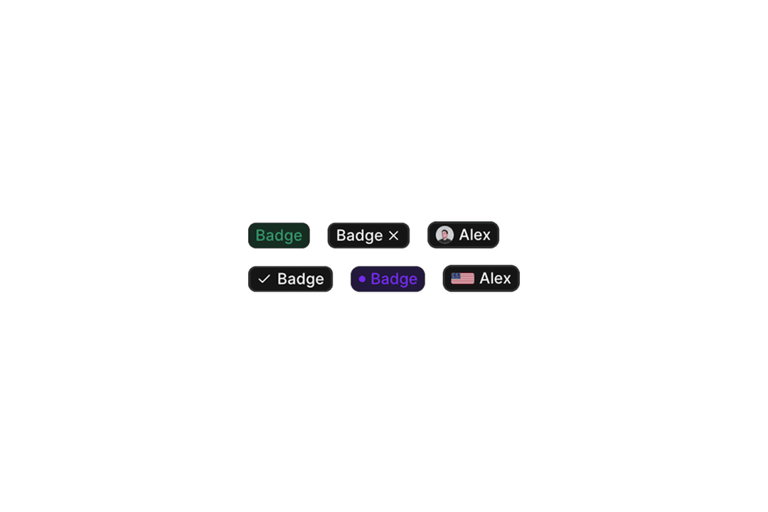
- Shadcn BadgeStatus labels, tags, and count chips: available as an in-house component with extended variants.
Shadcn Components vs. In-House Components
ReUI components fall into two categories. Standard shadcn/ui components such as Button, Dialog, and Table extend base shadcn/ui primitives with production-ready layouts you will not find in minimal docs demos. In-house components such as Data Grid, Kanban, and Filters are built and maintained by the ReUI team for dashboard-grade workflows not covered by base shadcn/ui.
All in-house components follow the shadcn copy-and-own installation model and ship in two API flavors: a Radix UI version for teams using Radix-based shadcn primitives, and a Base UI version for teams using @base-ui/react. Both versions share identical Tailwind CSS styling; only the underlying headless primitive differs. Each has dedicated documentation covering the full component API, prop references, and usage examples.
Shadcn Create Compatibility
All ReUI components are fully compatible with Shadcn Create. The 8 named themes (Vega, Nova, Maia, Lyra, Mira, Luma, Sera, and Rhea) and the style controls for Radius, Font Family, Base Color, and Color Scale propagate to every component preview. The component source you copy uses the same CSS variable tokens, so what you see in the preview is exactly what you get in your project.
This applies to both standard and in-house components. In-house components like Data Grid and Kanban reference the same --radius, --background, --foreground, and --primary tokens that Shadcn Create writes to your globals.css.
Radix UI and Base UI Compatibility
ReUI supports both major headless stacks in the React ecosystem. Standard shadcn/ui components follow Radix UI primitives. In-house components that need headless state are offered in both Radix UI and Base UI API versions via @base-ui/react, with the same Tailwind styling and layout expectations.
Teams migrating from Radix UI to Base UI, or starting a new project with Base UI, can use the Base UI variants without redoing your theme or markup. In-house component documentation at ReUI Docs explains both API options with prop references and usage examples.
Frequently Asked Questions
Start building with ReUI Pro today.
Every Pro block, every style, and every future addition, with one license.
From $249, once. Lifetime updates.