Shield Cross Icon
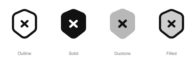
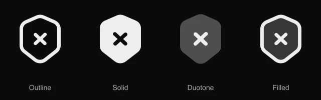
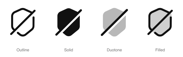
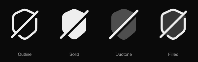
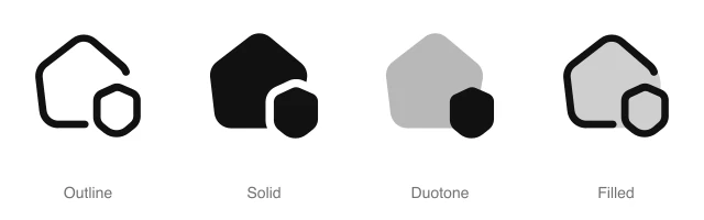
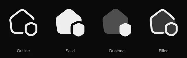
Hexagonal shield with an X mark, for blocked requests, failed security checks and unsafe warnings. Available in 4 styles (outline, solid, duotone and filled) as a React component you install with the shadcn CLI.
Preview
- 16px
- 20px
- 24px
- 32px
Install and code
Shield Cross icon in shadcn/ui components
Button
Icon button
Button group
Badge
Dropdown menu
Input group
Empty state
Shield Cross icon FAQ
What does this icon show?
Hexagonal shield with an X mark, for blocked requests, failed security checks and unsafe warnings. Typical uses: blocked request indicator, failed security check status and unsafe link warning.
When should I use it instead of a similar icon?
Use it for:
- Blocked rows in a firewall or sign in log, beside the rule that stopped the request
- Failing packages and files in a dependency or malware scan report
- Warning pages that stop a visitor before an unsafe link or download opens
For protection switched off by an admin, such as a paused firewall, use the Shield Slash icon. For a failed payment or upload with no security cause, use the Cross Circle icon.
Which styles does it come in?
4 styles: Outline, Solid, Duotone and Filled. Every style is drawn on the same 24 by 24 grid and installs as its own file, so you can switch styles without touching the layout.
How do I install it with the shadcn CLI?
Copy the install command from the panel above, in the style you want, and run it in your project. The shadcn CLI adds the icon as a React component that you import and render like any other. It draws in the current text color, so your text color and size classes style it. Icon installs need a ReUI Ultimate license.
What icons go well with it?
Icons from the same family and the Security set: Shield, Shield Round, Shield Search, Shield Slash, Shield Tick and Eye.
When was it added?
It joined the ReUI icon library on June 30, 2026.
Icons related to Shield Cross
For AI Agents
Hand your agent this brief or the ReUI MCP, not a screenshot. Installs with a ReUI Ultimate license.
When to use
- Blocked rows in a firewall or sign in log, beside the rule that stopped the request
- Failing packages and files in a dependency or malware scan report
- Warning pages that stop a visitor before an unsafe link or download opens
When not to use
- Protection switched off by an admin, such as a paused firewall: use the Shield Slash icon
- A failed payment or upload with no security cause: use the Cross Circle icon
Agent notes
- Name an icon-only button with its label, "Block IP address", as the aria-label
Markdown
https://reui.io/icons/preview/shield-cross.mdMCP
get_icon("shield-cross")Install
npx shadcn@latest add @reui/icons/default/duotone/shield-crossStart building with ReUI Pro today.
Every Pro block, every style, and every future addition, with one license for unlimited projects.
Get All-Access
From $249, once. Lifetime updates.