Cross Outline Icon
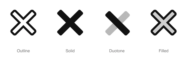
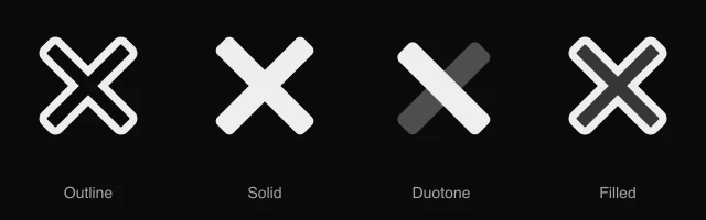
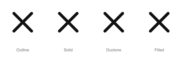
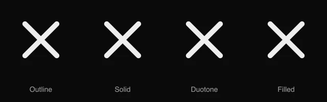
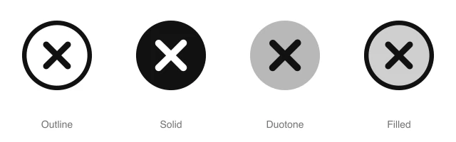
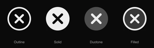
AnimatedBold X of two wide crossing bars, for heavy close buttons, reject actions and wrong answer marks. Available in 4 styles (outline, solid, duotone and filled) with an animated variant, as a React component you install with the shadcn CLI.
Preview
- 16px
- 20px
- 24px
- 32px
Install and code
Cross Outline icon in shadcn/ui components
Button
Icon button
Button group
Badge
Dropdown menu
Input group
Cross Outline icon FAQ
What does this icon show?
Bold X of two wide crossing bars, for heavy close buttons, reject actions and wrong answer marks. Typical uses: close button on a large overlay, wrong answer mark in a quiz and reject action in a review queue.
When should I use it instead of a similar icon?
Use it for:
- Marks on graded quiz answers the learner got wrong, shown beside the right answer
- Pass or reject buttons in a swipe or moderation queue, opposite an approve control
- Close buttons on full screen lightboxes and video overlays above busy images
For the close control on a regular dialog, sheet or toast, use the Cross icon. For failed jobs and declined payments in a status column, use the Cross Circle icon. For a medical or first aid marker drawn as an upright cross, use the Plus Outline icon.
Which styles does it come in?
4 styles: Outline, Solid, Duotone and Filled. Every style is drawn on the same 24 by 24 grid and installs as its own file, so you can switch styles without touching the layout. An animated variant also plays a short animation on hover, or whenever your code starts it.
How do I install it with the shadcn CLI?
Copy the install command from the panel above, in the style you want, and run it in your project. The shadcn CLI adds the icon as a React component that you import and render like any other. It draws in the current text color, so your text color and size classes style it. Icon installs need a ReUI Ultimate license.
What icons go well with it?
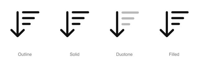
Check and Trash sit beside it in the same toolbar or menu. More from the same family and the Actions set: Arrow Down Wide Narrow, Arrow Up Wide Narrow, Backspace and Bookmark.
When was it added, and what was it called before?
It joined the ReUI icon library on June 30, 2026. It was previously named abstract-11, and that install name still resolves to this icon.
Icons related to Cross Outline
For AI Agents
Hand your agent this brief or the ReUI MCP, not a screenshot. Installs with a ReUI Ultimate license.
When to use
- Marks on graded quiz answers the learner got wrong, shown beside the right answer
- Pass or reject buttons in a swipe or moderation queue, opposite an approve control
- Close buttons on full screen lightboxes and video overlays above busy images
When not to use
- The close control on a regular dialog, sheet or toast: use the Cross icon
- Failed jobs and declined payments in a status column: use the Cross Circle icon
- A medical or first aid marker drawn as an upright cross: use the Plus Outline icon
Agent notes
- Name an icon-only button with its label, "Reject", as the aria-label
Markdown
https://reui.io/icons/preview/cross-outline.mdMCP
get_icon("cross-outline")Install
npx shadcn@latest add @reui/icons/default/duotone/cross-outlineStart building with ReUI Pro today.
Every Pro block, every style, and every future addition, with one license for unlimited projects.
Get All-Access
From $249, once. Lifetime updates.