Share Icon
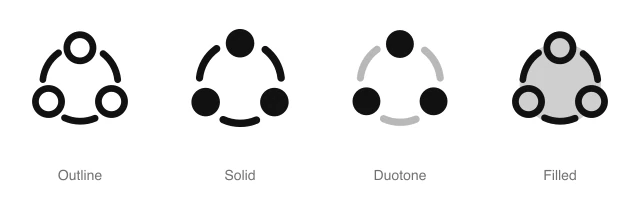
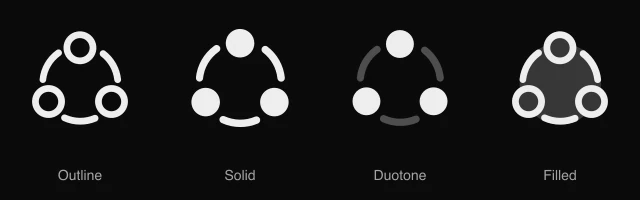
Three circular nodes linked by curved arcs in a ring, for sharing content, social links and networks. Available in 4 styles (outline, solid, duotone and filled) as a React component you install with the shadcn CLI.
Preview
- 16px
- 20px
- 24px
- 32px
Install and code
Share icon in shadcn/ui components
Button
Icon button
Button group
Badge
Dropdown menu
Input group
Share icon FAQ
What does this icon show?
Three circular nodes linked by curved arcs in a ring, for sharing content, social links and networks. Typical uses: share button on a post or article, share sheet trigger in a mobile header and invite collaborators with a share link.
When should I use it instead of a similar icon?
Use it for:
- Web and Android share buttons on posts, products and listings that open the share sheet
- Sharing a board, file or dashboard with teammates through a link or an invite dialog
For an Apple style share sheet trigger in an iPhone or Mac app, use the Exit Up icon. For sending a message, reply or invite straight to a person, use the Paper Plane icon. For copying a page address so it can be pasted elsewhere, use the Link icon.
Which styles does it come in?
4 styles: Outline, Solid, Duotone and Filled. Every style is drawn on the same 24 by 24 grid and installs as its own file, so you can switch styles without touching the layout.
How do I install it with the shadcn CLI?
Copy the install command from the panel above, in the style you want, and run it in your project. The shadcn CLI adds the icon as a React component that you import and render like any other. It draws in the current text color, so your text color and size classes style it. Icon installs need a ReUI Ultimate license.
What icons go well with it?
Bookmark and Copy sit beside it in the same toolbar or menu. More from the same family and the Actions set: Arrow Down Wide Narrow, Arrow Up Wide Narrow, Backspace and Bookmark Check.
When was it added?
It joined the ReUI icon library on June 30, 2026.
Icons related to Share

For AI Agents
Hand your agent this brief or the ReUI MCP, not a screenshot. Installs with a ReUI Ultimate license.
When to use
- Web and Android share buttons on posts, products and listings that open the share sheet
- Sharing a board, file or dashboard with teammates through a link or an invite dialog
When not to use
- An Apple style share sheet trigger in an iPhone or Mac app: use the Exit Up icon
- Sending a message, reply or invite straight to a person: use the Paper Plane icon
- Copying a page address so it can be pasted elsewhere: use the Link icon
Agent notes
- Name an icon-only button with its label, "Share post", as the aria-label
Markdown
https://reui.io/icons/preview/share.mdMCP
get_icon("share")Install
npx shadcn@latest add @reui/icons/default/duotone/shareStart building with ReUI Pro today.
Every Pro block, every style, and every future addition, with one license for unlimited projects.
Get All-Access
From $249, once. Lifetime updates.