Hexagon Link Icon
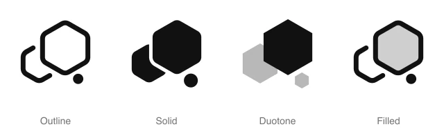
AnimatedLarge hexagon overlapping a smaller one at lower left, with a small dot below right, for clusters, nodes and groups. Available in 4 styles (outline, solid, duotone and filled) with an animated variant, as a React component you install with the shadcn CLI.
Preview
- 16px
- 20px
- 24px
- 32px
Install and code
Hexagon Link icon in shadcn/ui components
Button
Icon button
Button group
Badge
Dropdown menu
Input group
Sidebar
Empty state
Hexagon Link icon FAQ
What does this icon show?
Large hexagon overlapping a smaller one at lower left, with a small dot below right, for clusters, nodes and groups. Typical uses: grouped items marker in a diagram, cluster marker in a network view and geometric accent in a feature card.
When should I use it instead of a similar icon?
Use it for:
- Cluster rows in an infrastructure dashboard that group several nodes under 1 name
- Molecule and chemistry topics in a course catalog or a lab inventory
For resizing an image or setting a canvas's width and height, use the Size icon. For hyperlinks and URL fields in an editor or a form, use the Link icon. For a single server or validator node in a cluster's node list, use the Hexagon Dot icon.
Which styles does it come in?
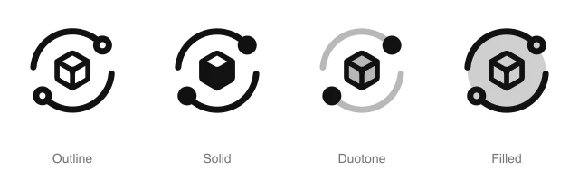
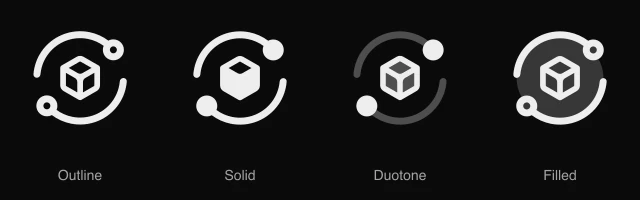
4 styles: Outline, Solid, Duotone and Filled. Every style is drawn on the same 24 by 24 grid and installs as its own file, so you can switch styles without touching the layout. An animated variant also plays a short animation on hover, or whenever your code starts it.
How do I install it with the shadcn CLI?
Copy the install command from the panel above, in the style you want, and run it in your project. The shadcn CLI adds the icon as a React component that you import and render like any other. It draws in the current text color, so your text color and size classes style it. Icon installs need a ReUI Ultimate license.
What icons go well with it?
Icons from the same family and the Shapes set: Hexagon Dot, Hexagon Nested, Exclamation Hexagon, Information Hexagon, JS Hexagon and Link.
When was it added, and what was it called before?
It joined the ReUI icon library on June 30, 2026. It was previously named abstract-25, and that install name still resolves to this icon.
Icons related to Hexagon Link
For AI Agents
Hand your agent this brief or the ReUI MCP, not a screenshot. Installs with a ReUI Ultimate license.
When to use
- Cluster rows in an infrastructure dashboard that group several nodes under 1 name
- Molecule and chemistry topics in a course catalog or a lab inventory
When not to use
- Resizing an image or setting a canvas's width and height: use the Size icon
- Hyperlinks and URL fields in an editor or a form: use the Link icon
- A single server or validator node in a cluster's node list: use the Hexagon Dot icon
Agent notes
- Name an icon-only button with its label, "Create cluster", as the aria-label
Markdown
https://reui.io/icons/preview/hexagon-link.mdMCP
get_icon("hexagon-link")Install
npx shadcn@latest add @reui/icons/default/duotone/hexagon-linkStart building with ReUI Pro today.
Every Pro block, every style, and every future addition, with one license for unlimited projects.
Get All-Access
From $249, once. Lifetime updates.