Diamonds Icon
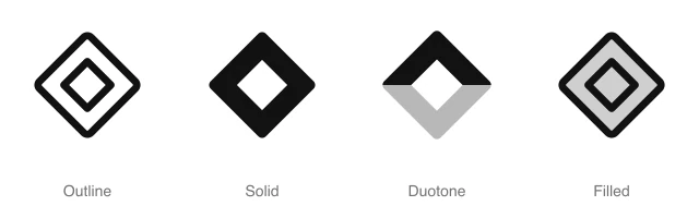
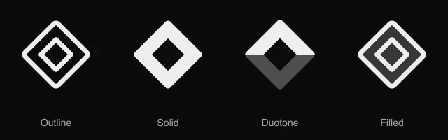
Gem silhouette with a flat top and pointed base, for premium tiers, rewards, luxury items and rare goods. Available in 4 styles (outline, solid, duotone and filled) as a React component you install with the shadcn CLI.
Preview
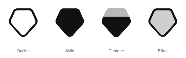
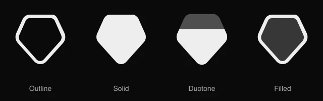
- 16px
- 20px
- 24px
- 32px
Install and code
Diamonds icon in shadcn/ui components
Button
Icon button
Button group
Badge
Dropdown menu
Input group
Sidebar
Empty state
Diamonds icon FAQ
What does this icon show?
Gem silhouette with a flat top and pointed base, for premium tiers, rewards, luxury items and rare goods. Typical uses: premium plan badge, loyalty reward indicator and rare item label in marketplace.
When should I use it instead of a similar icon?
Use it for:
- Gem and diamond currency balances in a game shop or a rewards wallet header
- Tier badges named after gems, such as Diamond or Sapphire, in a loyalty program
- Jewelry and fine goods categories in a store menu, for gemstone pieces
For security status, protection plans and account safety checks, use the Shield icon. For membership upgrades to VIP or Pro in a pricing table or paywall, use the Crown icon. For achievement badges a user earns for finishing a course or a streak, use the Award icon.
Which styles does it come in?
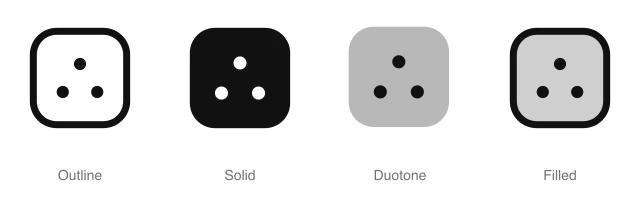
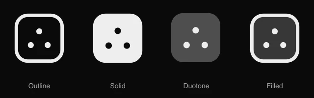
4 styles: Outline, Solid, Duotone and Filled. Every style is drawn on the same 24 by 24 grid and installs as its own file, so you can switch styles without touching the layout.
How do I install it with the shadcn CLI?
Copy the install command from the panel above, in the style you want, and run it in your project. The shadcn CLI adds the icon as a React component that you import and render like any other. It draws in the current text color, so your text color and size classes style it. Icon installs need a ReUI Ultimate license.
What icons go well with it?
Icons from the same family and the Shapes set: Arcs Radiate, Circle Diamond, Circle Pinwheel, Circle Ring, Circle Swirl and Circle Weave.
When was it added?
It joined the ReUI icon library on June 30, 2026.
Icons related to Diamonds
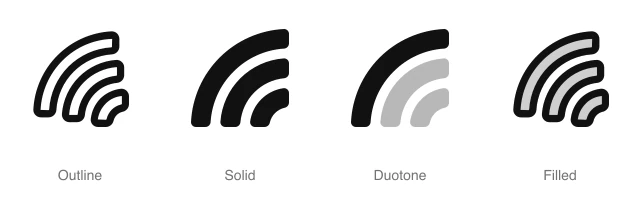
For AI Agents
Hand your agent this brief or the ReUI MCP, not a screenshot. Installs with a ReUI Ultimate license.
When to use
- Gem and diamond currency balances in a game shop or a rewards wallet header
- Tier badges named after gems, such as Diamond or Sapphire, in a loyalty program
- Jewelry and fine goods categories in a store menu, for gemstone pieces
When not to use
- Security status, protection plans and account safety checks: use the Shield icon
- Membership upgrades to VIP or Pro in a pricing table or paywall: use the Crown icon
- Achievement badges a user earns for finishing a course or a streak: use the Award icon
Agent notes
- Name an icon-only button with its label, "Buy gems", as the aria-label
Markdown
https://reui.io/icons/preview/diamonds.mdMCP
get_icon("diamonds")Install
npx shadcn@latest add @reui/icons/default/duotone/diamondsStart building with ReUI Pro today.
Every Pro block, every style, and every future addition, with one license for unlimited projects.
Get All-Access
From $249, once. Lifetime updates.